Visualization of the number of tabs in a two-tab display
-
I use "Stack with related tabs" when creating new tabs. At this time the first level tab shows the number of stacks by number.
Of course "numbers" are clear and easy to understand, but I prefer to identify by "sense". I would like to be able to draw a bar at the bottom of the tabs to represent the number, like the stack display in the previous version.
-
@izacks Enable Compact Display Style.
-
Oh, thank you.
I have found that setting. So that's what the compact type means.
I would like to change the color of the bar. It affects the color of the tabs and can be hard to see.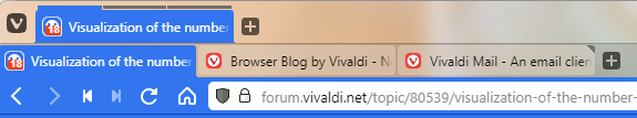
-
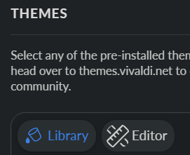
@izacks Try different themes, or edit one that you like.
-
 P pafflick moved this topic from Desktop Feature Requests on
-
@izacks
Use this code:.tab-group-indicator .tab-indicator.active {background-color: #3f81ea !important;} .tab-group-indicator .tab-indicator {background-color: #fff !important;}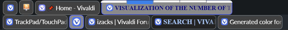
Change the color "#3f81ea" for active tab and "#fff" for the inactive tabs that suits your theme.
To do it follows this instructions:
https://forum.vivaldi.net/topic/61571/generated-color-for-tabs/4
-
@barbudo2005 Thank you. I have specified the tab color as the active color, can I change the CSS value dynamically?
-
What you mean with dynamically?
For example, the color of the favicon of the site of the active tab?
Follow this instructions and code:
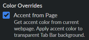
1.- Enable this setting in editor of theme:
Enable this setting: "Accent from Page":
2.- Use this code:
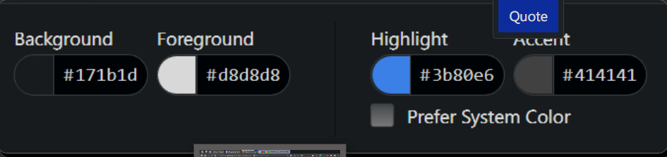
.address-top .mainbar > .toolbar-mainbar .toolbar-extensions:after,
.address-top .mainbar > .toolbar-mainbar:after,
.bookmark-bar:after,
.bookmark-bar-top:after,
.bookmark-bar button:after,
.bookmark-bar.default:after,
.observer:after,
.bookmark-bar,
.mainbar:before,
.toolbar-mainbar:before,
.toolbar-extensions:before

{content: unset !important;
border: 0px #414141 solid !important;
background-color: #414141 !important;}
The color " #414141" is my Accent color, so replace for yours:
3.- Replace this code for the previous one in the active tab:
tab-group-indicator .tab-indicator.active

{background-color: var(--colorAccentBg) !important;}
Vivaldi generate all this colors:
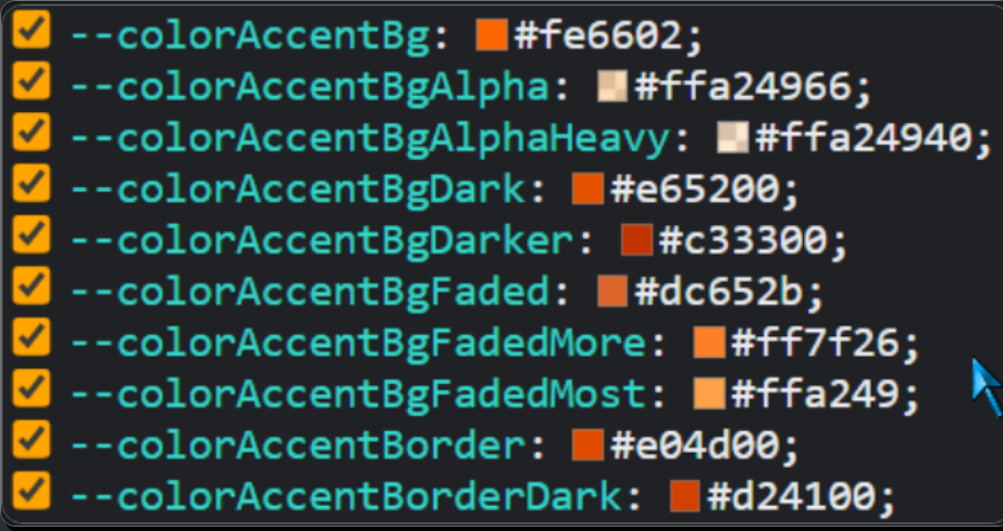
/* DEFAULT*/

    --colorAccentBg: #fe6602;

/*DARKER*/

    --colorAccentBgDark: #e65200;
    --colorAccentBgDarker: #c33300;

/* FADED*/

    --colorAccentBgFaded: #dc652b;
    --colorAccentBgFadedMore: #ff7f26;
    --colorAccentBgFadedMost: #ffa249;

/*BORDER*/

    --colorAccentBorder: #e04d00;
    --colorAccentBorderDark: #d24100;
So depending on your theme or the intensity you want to give to the highlight of the active tab, you can use any of this Accents colors.


-
I hadn't noticed in your images that you already use setting: "Accent from Page".
So don't use the code in point 2.-. I used it to revert the colors of the bars to the original color of the theme.