New Bookmark Window
-
V introduced a badly needed improvement in 3.8 for those of us who frequently - or in my case ALWAYS - select it's destination folder B4 making a new bookmark. Unfortunately the implementation in 3.8 was buggy and is better in 4.0 but still has serious shortcomings:
-- Like all of V's menus it has a vague, 'washed out" UI that makes it hard to find the block to enter your data.
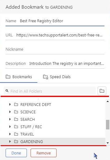
-- It doesn't sort the Bookmark folders alphabetically OR allow me to D&D them into any order of my own so it's hard to find the folder I need. (see image)
-- It allows the Bookmark Folder Window only 31% of the vertical space available while wasting a lot of space that could be condensed. ie: Speed Dial IS a bookmark folder so this choice seems redundant. "Added Bookmark to" header is both wrong (B4 i've even selected a folder) and unnecessary once you select your desired folder. The window showing the Bookmark folders could easily be 50% of the window - making the selection much easier.
-
@kosmonaut I agree that there might still be room for improvement to the Added Bookmark Dialog. Bookmarks are already added when you open the dialog. Remove only moves them to Trash.
- That depends on the Theme
- True, but there is a search field
- Bookmarks - Speed Dial line is redundant for me, but there are users who have multiple speed dials. I even removed the Use as Speed Dial and Remove from Speed Dial items from my Bookmark List menu in Settings, Appearance, Menu Customization. The bookmark list does not include any extra folders that are tagged to use as Speed Dial Folders.
- I think making the dialog even bigger would upset more users than it would please. The extra fields at the top could be collapsed by default, but they are useful for users who always edit their bookmarks on adding them. Adding the Automatic description can be disabled in Settings.
-
Thanks, once again, for replying.
You said: "That depends on the Theme"
Not in my experience. Changing the tint of a window doesn't make it more or less usable if the window components are all essentially the same shade of blah... This is a UI design issue which has never been Opera's or Vivaldi's strong suite.
And: "True, but there is a search field"
Sorry but a bookmark folder window that doesn't allow for either alphabetization or manual sorting is broken.
And: "making the dialog even bigger would upset more users than it would please"
I'm not suggesting making the entire 520 pixel window taller - just making the folder window portion of it a greater % of the total window. I can be done and since the individual folders are just jumbled together in no logical order it would greatly benefit for such a redesign.
And: "adding the Automatic description can be disabled in Settings."
Where, specifically, please.
-
Hi,
at first, the new Bookmarking was horribly slow, didn't remember the last Bookmark's location for the next one, and didn't set the focus on search results in the folders list.
Also horribly Mouse-oriented, some field navigation wasn't doable by keyboard alone at all.This is markedly better since at least the last version 4.0.2312.36 (Stable channel) stable (64-bit) i got:
- Remembers last location,
- on search filters the Tree is pruned; if you then Tab, Tab, the pruning falls away, but the searched-for Target is focused.
- Keyboard navigation is apparently complete again
- and the overall speed is back to normal.
.
I, for one, am relieved, and can live with the new Bookmarking style.
--
regards,
-- rec00k
-
 P pafflick moved this topic from Vivaldi for Windows on