Can font rendering be improved?
-
I've been looking at Vivaldi development and the browser is becoming really nice! One thing that I would love to be improved is the font rendering on Windows - compared with other non-webkit browsers the fonts look more pale and reading text is less comfortable. This is not Vivaldi specific - it's happening in all webkit browsers, I think it was Chrome version 35 when they "improved" the font rendering for Windows and since that time all webkit browsers inherited the change. While the fonts look smooth they are too pale when the text is dark on light background but when light on dark background the fonts look over-bolded. To illustrate this look at these screenshots at 100% zoom showing the same page in Vivaldi, Firefox and Edge (from left to right respectively): cnn.com:

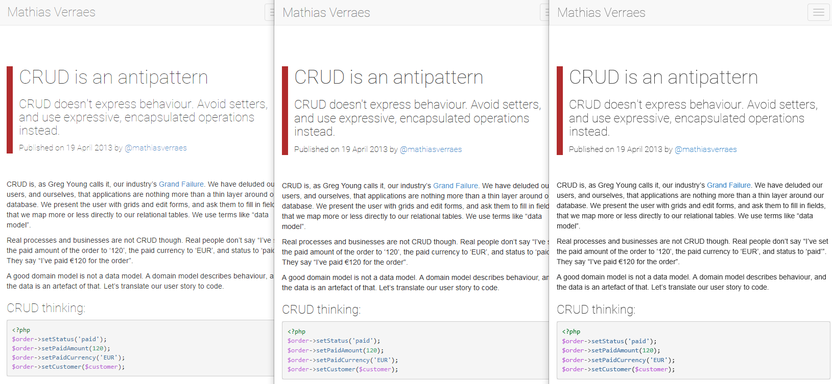
Even more pronounced difference at http://verraes.net/2013/04/crud-is-an-anti-pattern/ :
As you can see the font is most pale in Vivaldi and looks better in Firefox and Edge - by better I mean sharper and slightly bolder, Edge seems to show black fonts that are "most black" out of the three browsers. I've noticed there are some cases where the webkit rendering is overall better and less jaggy but it happens only with some very rarely used fonts - most of the time I avoid using webkit browsers for any extended periods of time because I simply don't enjoy reading overly pale or washed-out fonts since they are more demanding on my eyes. Can something be done about this in Vivaldi? I would like the text to look clear and sharp - more like in Firefox or IE/Edge. I've seen the same behaviour on different computers so I'm sure it's not a matter of my system or graphics card.
-
Disabling the direct write on vivaldi://flags/ can improve a bit the font rendering.
Some extension like this
https://chrome.google.com/webstore/detail/font-rendering-enhancer/hmbmmdjlcdediglgfcdkhinjdelkiock
Can improve it further, at the price of some visualization problems on some sites
-
I'll try that extension and disable DirectWrite. I find the fonts kind of jagged too. One thing that does also help a little bit is setting the font encoding in the Vivaldi settings to Western(Macintosh). Somehow that helps a bit.
Edit: Having both DirectWrite disabled and the Font Enhancer extension enabled isn't good. It's better to not disable DirectWrite, but keep the Font Enhancer extension.
-
I personally use a program called MacType that renders the entire Windows UI text the same as it would in OS X (greyscale antialias and outline rendering with no font hinting). Disable Directwrite in Vivaldi so these settings carry onto the browser.
-
I personally use a program called MacType that renders the entire Windows UI text the same as it would in OS X (greyscale antialias and outline rendering with no font hinting). Disable Directwrite in Vivaldi so these settings carry onto the browser.
Thank you rnet, I tried that and I now love it! I also disabled Directwrite. I disabled my extension Font Rendering Enhancer, but turned it back on again because it made it even better. This combination makes it amazing, you have to try it!
-
I personally use a program called MacType that renders the entire Windows UI text the same as it would in OS X
I think mosto of the people don't like the Appleish feeling of the blink/webkit font rendering and wants the fonts that looks as good as in the other Windows/Linux browsers.
-
MacType, despite its name, is essentially FreeType 2 for Windows. So while it can be set up to somewhat resemble the OS X font rendering, it's really Linux font rendering. And the biggest advantage of it is it's very customizable - so, unlike with anything Windows offers, you can finetune the font rendering exactly to your liking in a wide variety of possibilities.
Sadly, MacType doesn't work very well, as it's been abandoned a while ago. So even if you manage to get it work with Blink-based browsers, there are usually issues - the least of those being that the terrible "sharpening" of fonts Blink-based browsers insist on doing usually carries over even when you disable DirectWrite.
And, honestly, I for one would love to be able to get true OS X font rendering in Windows. But I'd like a fully functional MacType more, 'cause I could tweak it exactly to my liking. Which is exactly what I used to do before DirectWrite and Blink came and ruined it all.
-
Okay, so I've been playing around with other browsers on portable USB, and I tried O12, and man, that font rendering is better than even Firefox! Though I do have MacType enabled, I didn't have to tweak anything in O12 to get very nice, print-like inky font rendering on my webpages, which I do like.
I hope that someday the Vivaldi team can contribute their own font rendering into Chromium code, or somehow bypass it and change it for Vivaldi so it uses FreeType/MacType-like font rendering instead.
-
@purgatori:
It's certainly possible. Sleipnir uses the Blink engine, and yet manages to output much nicer fonts than Chrome.
A matter of taste, I suppose. I find Sleipnir font rendering kind of horrid. Opera 12 does, indeed have good font rendering.
-
From my humble perspective, Olde Opera will always be the gold-standard for font legibility and ease-of-read… at least, until something else comes along that equals or exceeds it. (hint, hint...
") ) The newer generation of browser fonts (especially chromish ones) leave a lot to be desired for crispness, etc. The impression I continually have with such fonts is a general bluriness or fuzziness that make me sometimes think I need glasses. Then I use Olde Opera and I realize that it's not me, it's the fonts...
) The newer generation of browser fonts (especially chromish ones) leave a lot to be desired for crispness, etc. The impression I continually have with such fonts is a general bluriness or fuzziness that make me sometimes think I need glasses. Then I use Olde Opera and I realize that it's not me, it's the fonts... -
I totally agree, but this is a problem with all Chromium browsers.
Reading text is so extremely hard on the eyes. You notice the difference intermediately when you switch to Edge/Explorer or even Firefox. Firefox makes the text a bit stronger which is more easy on the eyes for reading. The text is just so pale that its really frustrating to read articles without having to zoom in and sadly this does not work well in Vivaldi either. The zoom shortcuts and features are a miss and hit on each release. The text is rather fuzzy or blurry.
Maybe we power users are getting older, but I also find the font rendering to be rather bad, at least on Windows.
-
@purgatori:
It's certainly possible. Sleipnir uses the Blink engine, and yet manages to output much nicer fonts than Chrome.
A matter of taste, I suppose. I find Sleipnir font rendering kind of horrid. Opera 12 does, indeed have good font rendering.
It has nothing to do with taste since the fonts are still the same. I'm not talking here about the fonts but how readable they are. If the blacks are not strong blacks or look pixelated that creates a blurry effect since there are white lines between them.
Sleipnir shows exactly what the problem is with Vivaldi and Chrome here:
http://www.fenrir-inc.com/us/img/sleipnir/desc_02_bg.pngAt least on my computer that is how exactly how they look. Left would be Chromium, and right would be Firefox and or Edge as both display the text correctly.
In the left image, the lines are not really connected and have white pixels on them. This makes the text very hard to read. The right image there is more similar to how Firefox displays exactly the same text/page.
So if Sleipnir can do it, so can Vivaldi. You cannot honestly tell me the left text is easier to read.
-
Don't know where you found text such as on the left. I have never seen anything like that on any of my machines. It's horrible. If that's what you get on your machine in Vivaldi I could understand your anxiety.
I find (as a matter of MY TASTE) the way Sleipnir renders text to be too heavy and obtrusive. It's actually harder for me to read than a lighter-weight text. The weight of Firefox text is ok, but it is microscopic on my machine unless I zoom the page. Old Opera text was really good. Not to heavy, not too light, smooth edges, etc.
On this machine right now, reading this board, the font is smooth and solid for me, but a little thin.
You need to zoom into the text which is what that image did.
Take a screenshot of both Chrome or Vivaldi (they look exactly the same anyway) and then take another screenshot of Edge or Firefox (they also render the same).
See the first attached image in my reply. That is how Vivaldi/Chrome renders the text, once you zoom them in with Photoshop.
The second image is from Firefox or Edge. I just took those images, the text is actually your above reply.
Do you see the difference in pixels? This is why the text in Firefox/Edge is darker or stronger. Chromium washes out some pixels so it creates a blurry effect.
Attachments:
 ,
,
-
I haven't noticed there have been so many replies to my initial question! My account got blocked for unknown reasons after my first post here so I didn't come back to read this thread.
Anyway, has anything changed in Vivaldi in respect of font rendering? I can see the same standard pale webkit style fonts on Windows and no option in the settings to customize it. There is even no DirectWrite option in the flags on my installation (and when I tried it a year ago it didn't do anything, anyway). Font Rendering Enhancer works well except it destroys text shadows on web sites, and possibly other css effects.
So still Vivaldi remains a browser which is not friendly to my eyes. Are the developers even aware of the problem and trying to come up with a solution? Does a bug report exist for that?
The browser is wonderfully getting new features but alas this core part remains substandard. Even in the UI and settings window I can see the webkit pale font rendering everywhere, which makes all the texts harder to read. It's such a relief switching from Vivaldi/Chrome/Opera to Firefox/IE/Egde in respect of font readability. But I'd like to use Vivaldi more.
-
@lemonjuice - The developers are very aware of it. To fix it, they would basically have to patch Chromium for every single build and then maintain that patch through every Chromium change, or build a separate font-rendering engine for Vivaldi alone, which they haven't the resources to do right now. Because there is such a small percentage of the user universe for whom Vivaldi fonts are problematic, font-fixing will have to wait until such time as other priorities are finished, or there are more personnel to work on the UI, or both.
-
 P pafflick unlocked this topic on
-
P pafflick moved this topic from Vivaldi for Windows on