A new style for Speed Dial
-
I designed a new style for Speed Dial, I'd like to call it "Compact Mode".
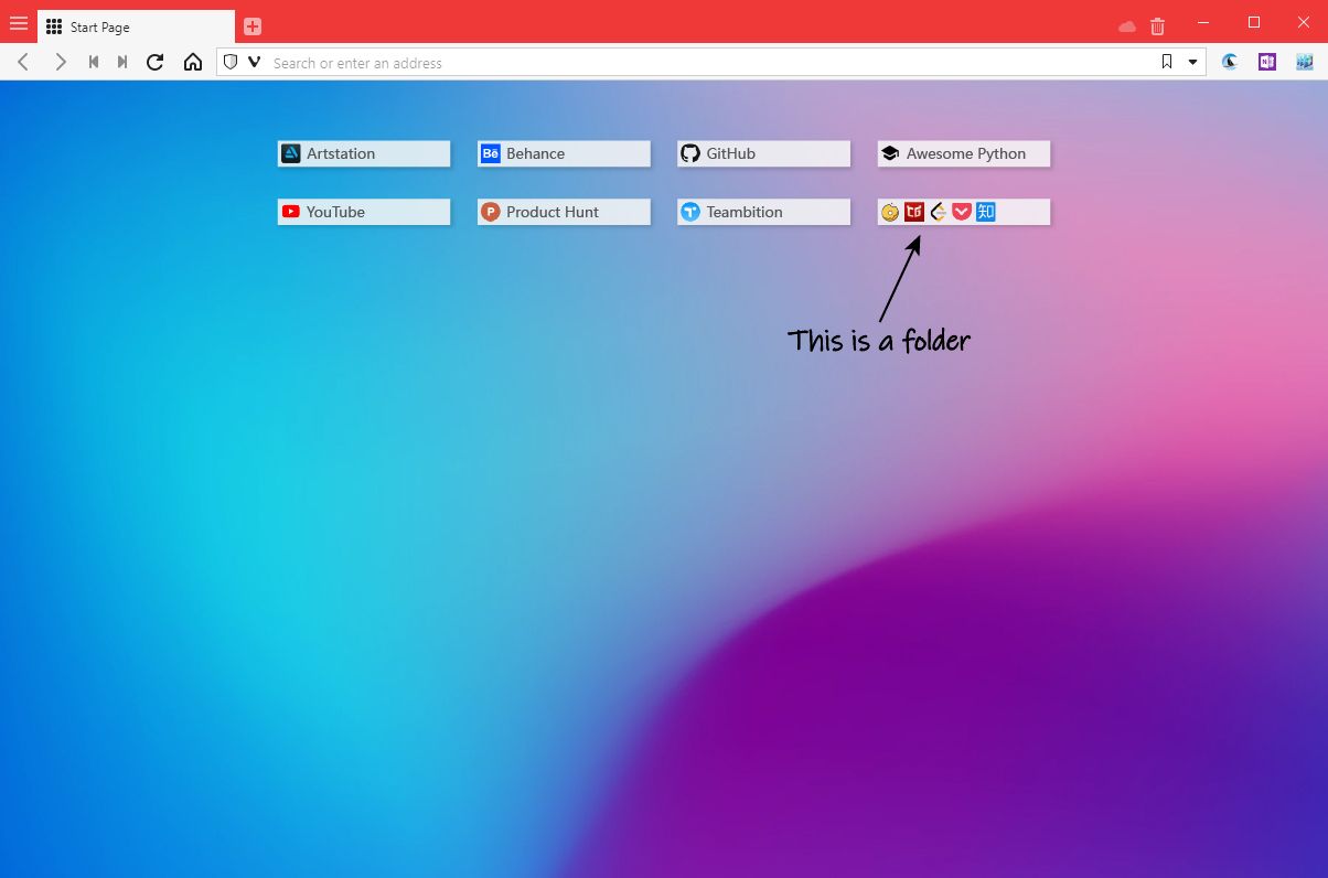
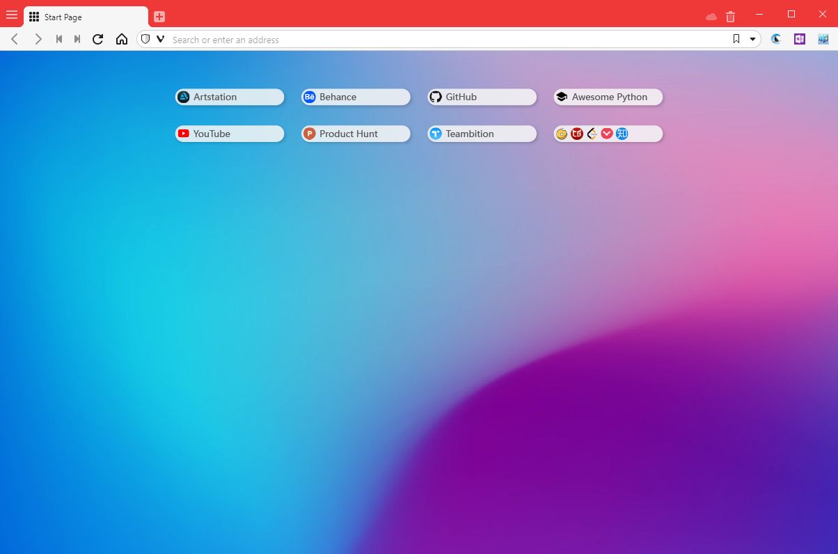
In this mode, we needn't to worry about the thumbnails. (I think Vivaldi can get the icon of web sites automatically).
And one screen area can hold more bookmarks.I hope Vivaldi add this style as an option, users can choose it or the default style.
-
@capedghost It's a visual concept or a mod? (Just in case someone is interested in a faster implementation).
Patience Is The Key To Get The Vivaldi Spree | Unsupported Extensions | Github | w11 + Kde Manjaro + Android 13
-
@capedghost Looks great!

-
@Hadden89 Oh, It's just a visual concept, not a mod, I'm not a developer. Actually, I don't know Vivaldi have "mods" before until I saw your reply and checked your GitHub page.
-
Yeah, very similar to the Speed Dial list view on android version. There was a suggestion iirc.
-
Agree. The speed dial page would benefit with some additional style/display options. In addition to the suggestion by the original poster, I'd like to see an option for a default iconizing all the speed dial bookmarks instead of just the bland bookmark icon or the manual request for a web page view.
-
 P pafflick moved this topic from Automotive News on
-
I agree, Speed Dial needs an urgent redesign. I find it pretty much useless at the moment.
Small random list of what I would add / change:
- custom positioning of individual items on grid (think smartphone homepage folders / shortcuts)
- custom resizing of individual items on the grid (think smartphone widgets)
- make it easier to go back up from lower levels (without having to move the mouse to the button on the top of the page)
- choose position of the name (top vs bottom)
- two lines of text for the name
- improve visual separation of the name from the folder and add setting for text alignment (left, center, right)
-
@RadekPilich said in A new style for Speed Dial:
I agree, Speed Dial needs an urgent redesign.
This is how a speed dial app should look.
https://chrome.google.com/webstore/detail/group-speed-dial/imfeikbeimbfpmgfkkmjekabdehiiajc