More intuitive UI for Android (suggestion)
-
Hello my Friends!
here are a lot of topics regarding UI elements and I would also like to share mine.First, the main-screen:
Current state (beta)

Suggestion
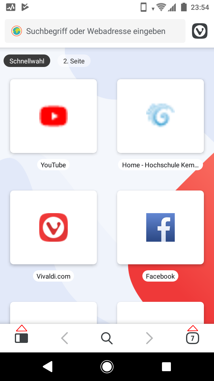
Buttons for the Bookmarks-Screen and the Tabs-Scree with arrows pointed up (and if open pointed down, see next images), everything else is fine as it is
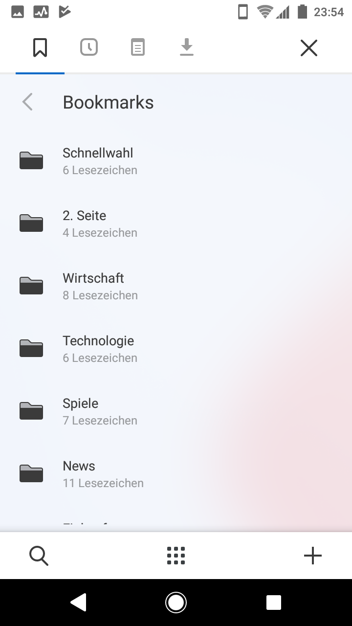
Bookmarks-Screen
Current state
Suggestion
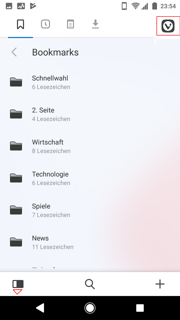
arrow pointed down (thus, if pressed, return to Main), search in the middle like main-screen and Vivaldi-Menu instead "X" like main-screen.
Tabs-Overview
Current state
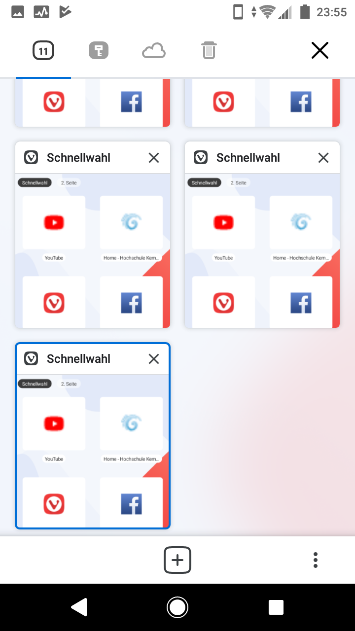
Suggestion
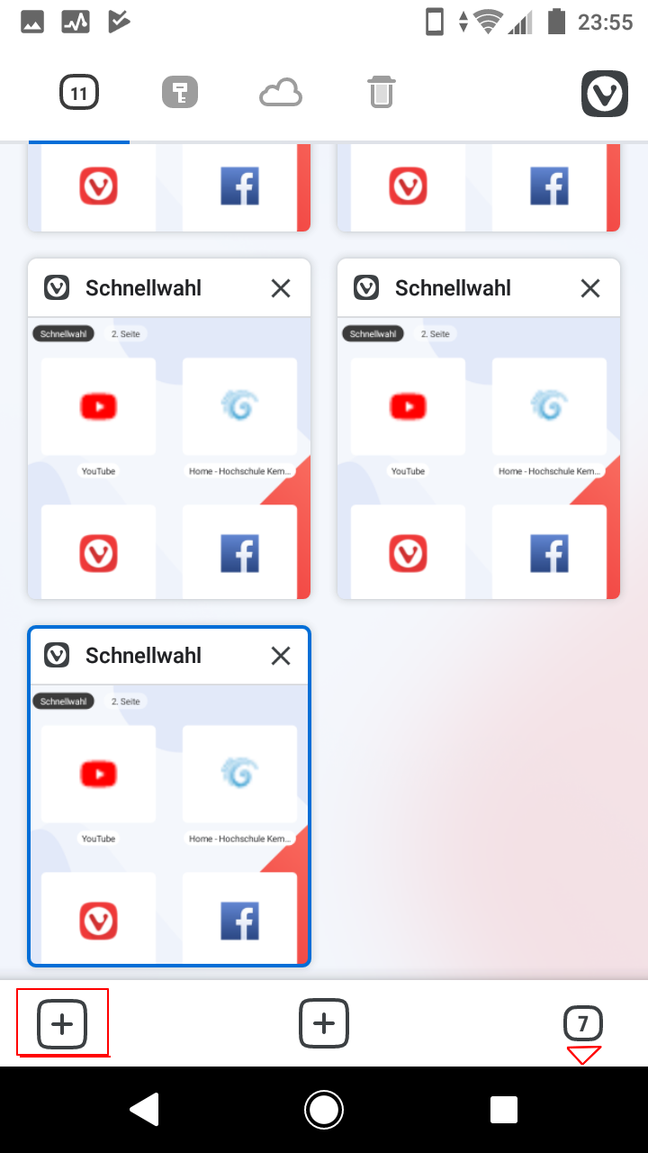
again pointed down arrow and the button in one place instead of "X" to return to main. In the upper bar Vivaldi-menu instead of "X". Add another "+" in inverted colours for private tab.
If they "swoosh" up like drawers, then it really easy to understand, that if you press in the same place, you get to the main-screen. Vivaldi-Menu is always in the same position and in the tab-overview the extra menu would be obsolete (to some extent)
What do you think?
-
Please clarify in the title and text that you only mean changing the animations, not the function of the buttons.
-
@madiso
The animation part would be actually the least important. It is more about a more intuitive layout in all of these screens. -
it's not that important with the regular 3 or 2 button Android system navigation systems but it's important with the new Android 10 gestures. In terms of the layout, this makes a lot more sense too as the button to open the tab switcher is in the same place as the button to close the tab switcher.
-
Thank you for your request. As this post has had less than 5 votes over 4 years it will now be archived.
-
 L LonM moved this topic from Mobile Feature Requests on