Hi-fi "highlight" color for our theme...
-
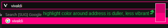
Please add an option to use high fidelity "highlight" color for our theme. So the highlight color is always shown vibrantly in its original 100% color, without dulling it. Currently, on some parts of the interface, it is dulled, which is unnecessary since the idea of a highlight color is to be bright. Example, the highlight color around the address is duller, less vibrant, which gives it a worse appearance. Please fix.

[bug reported VB-73430]
-
updated first post
-
this request is done