Tab management for wizards
-
A couple of weeks ago, PCWorld talked about Vivaldi’s “tab wizardry” and this couldn’t have come at a better time. Our recent survey shows that tab management features are growing on you.
Click here to see the full blog post
-
I always love those blog posts, as they always inspire me to step out of my normal way and try something different and see if it fits better in to my everyday workflow.
I was a bit irritated about the percentage of users that have their tabs to the left side as for me this will run into a lot of conflicts for opening and closing the panel. Second thought was that those may be users that are left-handed but I guess that this assumption is statistically unfounded - whatever the reason may be I decided to go for tabs to the right side for the rest of the week and decide afterwards if I could adapt to this or not.
Long story short I have a few questions about tabs at the side:
1.) How do you tell pinned tabs apart from such that aren't pinned (besides that there won't show a x at the right side?)
2.) Are there unread indicators? (atm I use slightly modified version of the normal dark theme without showing tab thumbnails if this matters)EDIT: Never mind about that "panel | tabs at one or the other side conflict".... I just remembered that we of course can switch the side where the panel should appear. My apologies
-
Cool.
")
Re "Whopping three-quarters of you prefer to place tabs at the top. The rest are experimenting with tabs at the bottom, left or right", back when survey was done i was still placing tabs my "traditional" way, at top. Each time i'd briefly experimented with them vertically i quickly abandoned it, coz i could never "see" which tab, sometimes even which stack, i was currently "in". One day, only ~2 months ago [blush], the penny finally dropped for me... disable Tab Thumbnails. I like seeing them [TT] with horiz tabs, so that box had been ticked for me "forever"... it'd become part of the V furniture & i'd completely forgotten about it. When i belatedly rediscovered it, whilst yet again trialling tabs on side, i giggled as insanely as i did when i discovered V in Feb 2015. Instantly vert tabs not only became "tolerable" for me, they became "sensational", & are now part of my standard workflow. That setting makes all the difference for vert tabs [for me]; if enabled, there's an overwhelming riot of colour & detail, in which my active tab gets visually lost. Disable it, & voila... sensationally practical.
-
@Steffie Just for the record and because I am curious, especially as I overthink my personal setup at the moment: Tabs to the right or left? And do you have the side panel appear at the same site or the opposite?
-
@zaibon
Okay, it seems as I can answer question 2 myself: Yes there are unread indicators and they are visible even with the dark theme I am using BUT there seems to be the mini bug that when you switch from top to vertical tabs, that tabs that showed an unread indicator before doesn't after switching.
Newly generated tabs (by mbb on a link) do show an indicator and after the first restart everything is back to what it should be.So I am already a bit happier about my tabs at the side ^^
-
@zaibon Teehee...
Spoiler
-
@Steffie This looks pretty neat - hrmpf... now I have to overthink my concept again ^^ And if I go without status bar I need to assign some gestures to the screen capture feature or rely more on the quick commands.... decisions, decisions
Sigh I better call my boss and tell him that I won't get any work done today due to errrh... technical issues
-
@zaibon: You could also move the Screen Capture button to the Address Bar

-
@zaibon When i recently revised & optimised my workflow, i changed my ages-old paradigm of always wanting/needing to see stuff, to instead hiding it by default & only showing on-demand via MGs...
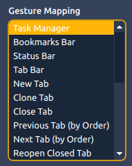
So now when i need to see my Status Bar [bottom] i MG it on then MG it off again... for BM Bar [top] i MG it on then MG it off again... for Tabs Bar i only rarely MG it off again but i can anytime i need more space temporarily.The flexibility at our fingertips is just astounding. Yay V.
♀ 🇦🇺
-
I guess I'm one of those with less than 10 tabs open. Anything more and I start to get "information overload" syndrome. I guess I don't really understand why anyone would want a lot of tabs open - after all you can only browse one page at a time. But I still love that you offer so many options for heavy tab-users, as these are usually the most advanced web users.
I'd like to turn off the tab bar completely, if it was replaceable by the Window panel for instance. The only thing stopping it for me is that the panel toggle stays up when I toggle the Window panel with Ctrl+Shift+W, and I have to press F4 to hide it again. If the panel toggle also went back to hidden it would be much better.
🎻Volunteer helper · Forum moderator · Sopranos tester 🛠️Troubleshooting 🐛Report a bug 📜Markdown help
🦆"With a rubber duck, one's never alone" -Douglas Adams🦆 -
@Pathduck Tab-hogging has various degrees:
- 1-10 is quite common;
- 11-20 is useful to check various sources to see what is the more reliable (check and close > repeat);
- 21-30 start to easily become "overload syndrome";
- 30+ could be used, but start to become less practical - for several reasons (I hate tab discarding, so it's off).
Usually tab-hoggers also use vertical tabs, as it takes less width (if resized) and is more practical to click than an horizontal tab bar which have to be scrolled - especially for the lack, at the moment, of multirow tabs.
For me: 3 and 10 are common; 20 can happen; 30 or 50 are less common.
Only use two gestures: close active tab; reopen last closed tab. Late adopter of them, Vivaldi 1.9.
Ctrl+X/Ctrl+C/Ctrl+Vare also widely used (cut|copy|paste).About the request, I asked something similar,
but I "lost" my request somewhere
//edit: 8 tabs now. 6 are Vivaldi, 1 is Fb, 1 is background music

-
@Steffie The real question is how much of my workflow I'd like to dedicate to my mouse and how much should be done by keyboard. At the moment I tend to do a lot with my keyboard as it is a new one and I fell in love with it ^^
But for the capture thing I need the mouse anyway to select the area I'd like to have shot - so a gesture makes sense in this case or as @OlgaA suggested I could of course paste the button for this to the address bar.I really start to get the feeling that this day will be a "flip-a-coin-day". xD
-
As a convicted tab hoarder I couldn't live without tab hibernation, or else my RAM would explode, but I always forget to to click. So I made my own extension which automates the process. It auto-hibernates all tabs after a certain time of inactivity apart from the active, pinned, white-listed and audio playing tabs.
Additionally, with that many tabs open, tab stacking does not make sense to me because it takes way more time to hover over the stack, wait for the thumbnails to appear, and then click on them.
It would be nice if the sorting of the window panel would influence that, but until we have that, I use another self written extension to keep my tabs tidy, which sorts my tabs by domain.This allows me to rapid fire the mouse button to close tabs (Align next close button)
I love the page notifications (Detect Page Title Notifications), because they draw my extensions in an unobtrusive way to to pages I need need my attention, I only wish more pages had that in the title.
Otherwise I am quite conventional with the tab bar at the top and only occasionally using the window bar because other panels need my attention.
-
Fun thing: Chrome is experimenting with tab stacking: https://www.digitaltrends.com/computing/chrome-canary-tab-grouping/
-
@QuHno Cool, would you mind sharing these extensions somewhere?
-
You're a wizard Vivaldi
-
@stbvf said:
@QuHno Cool, would you mind sharing these extensions somewhere?
... here you are: https://quhno.vivaldi.net/2019/04/10/auto-discard-and-tab-sorter-and-duplicate-remover/
-
Again, Tab Stacking would be much more comfortable and usable if you would give us the option to expand/collapse Tab Stacks, like it was in the old Opera Classic (Opera 12).
-
@zaibon: Answering your first question - the pinned tabs are at the top and, since I don't have that many pinned tabs, I know which ones they are and where they end
Personally I would prefer them to show as an icon (like when you have the tabs at the top), to save some vertical space and make them more distinguishable than the others (I believe there's already a feature request for this).
-
Great Article.
My only problem with Tab Cycling is that is follows the rules set for "Ctrl + Tab" and this makes using Tab Cycling by Mouse weird and hard for me.
My "Ctrl + Tab" uses the "Cycle in Recently Used Order" option which has been the best option for "Ctrl + Tab" since Opera days but when using the Tab Cycler with Mouse I really like the order to be from Left to Right (Like in Firefox or Chrome).
This is because if I use the "Right Click + Mouse Scroll" for Tab Cycling the Tabs switch haphazardly in the Recently used order style and this makes it really hard for me to keep track of the cycling since the tabs keep jumping in weird orders (based on my last visits to these tabs) and I can't control it.
If I wanted to Cycle Tabs with the Mouse and move to the third tab from the current one, I couldn't do it easily! This can be achieved Only by changing the Tab Cycling option from "Recently Used Order" to "Tab Order" But then I don't want to do that since it affect my "Alt + Tab" behavior.