Accessibility: Add subtle tint background for enabled extensions card
-
By default, you have to look for the blue switch & then find the card's content or vice versa:
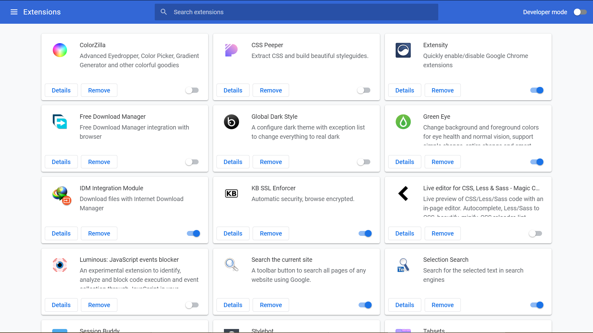
Improved, now content inside enabled extension card are grouped together: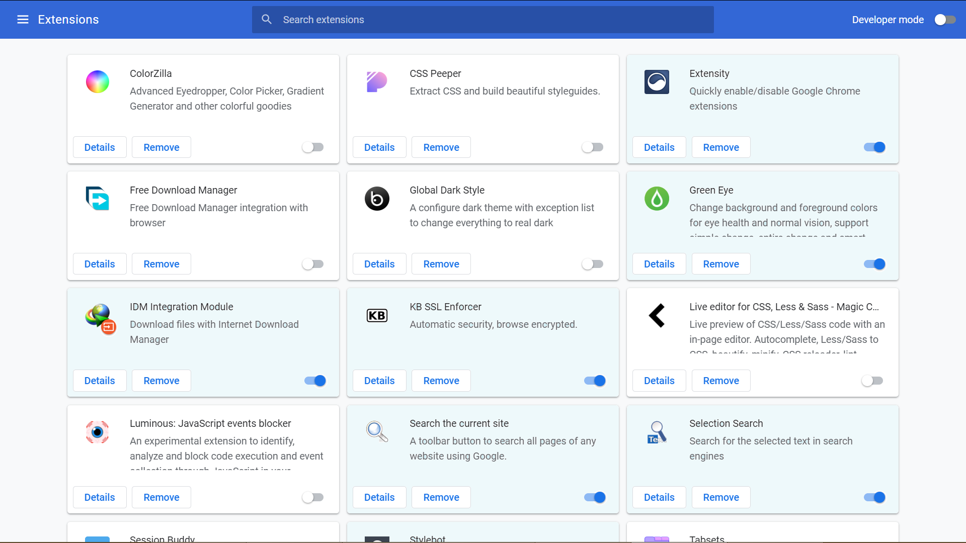
See, now it's much easier to spot all enabled extensions, even from afar!
-
Did you accidentally upload the same screenshot twice, because I fail to see a difference between them?
Nvm, it was a monitor issue (as @LonM mentioned). -
@Komposten I initially couldn't see the difference because my 2nd screen was calibrated poorly.
On my main screen I can see there is a very slight difference in colour for enabled extensions.
In terms of accessibility, it would probably work best if it was made far more obvious.
💻 Windows 10 64-bit Sopranos Builds • en-GB • 🗳 vote for features • 🕵️♀️ Code of Conduct • 🐞 Report bugs
-
I think the current Google Chrome extensions page is beyond hope/help. It makes no sense to doctor on it, because it has to be completely redesigned – and I hope that's what's gonna happen some day. Vivaldi needs to come up with their own version.
-
@LonM said in Accessibility: Add subtle tint background for enabled extensions card:
I initially couldn't see the difference because my 2nd screen was calibrated poorly.
Yeah, I'm on my desktop now and the difference is extremely evident. I guess my office monitor needs an upgrade...

-
@LonM I think the pic color r distorted while upload to V server, but u guys get the design concept. Default color design for each card failed to group all related element together, thus result with viewer have to tracking multiple elements to form a conclusion.
My suggestion is to group all related element together with a background color so that viewer can identify each extension's status in one glimpse.
-
@luetage
The whole extension manager needs to be rebuilt. Too many features missing from the inherited one. -
 L LonM moved this topic from Desktop Feature Requests on
-
Thank you for your request. As this post has had less than 5 votes over 4 years it will now be archived.