Custom Tab Stack CSS
-
Hello! New user here. I've been using Vivaldi for a while but never managed to use the tab stack feature as the UI was always against me).
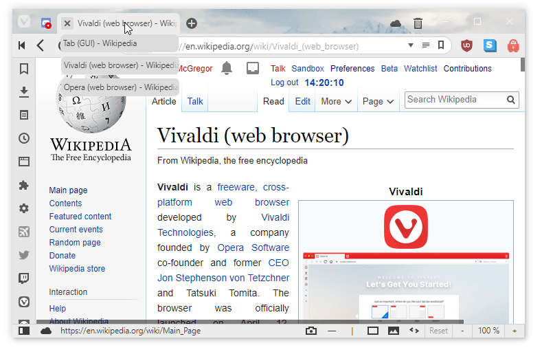
Recently I discovered you can tweak Vivaldi with CSS so I decided to try and see if I can improve the stacks a little.With this CSS the tiny tabs on a stack "grow" when hovered and change color.
Also the thumbnail previews now are easier to select, they are a bit smaller and have some sort of animation.I don't really know CSS so pardon me if the code doesn't look great, I just copied and paste from the inspector and did some trial and error, some variables I'm not even sure if they are doing something or not.
If anyone is willing to clean it up and explain I'll be happy to learn..stacks-on .tab-strip .tab:hover .tab-group-indicator .tab-indicator{ height: 20px; transition: 150ms; } .stacks-on .tab-strip .tab .tab-group-indicator .tab-indicator + .tab-indicator { margin-left: 3px; } .stacks-on .tab-strip .tab .tab-group-indicator .tab-indicator:hover { background-color: var(--colorAccentFgFaded); height: 22px; } .stacks-on .tab-strip .tab.active .tab-group-indicator .tab-indicator.active { background-color: var(--colorAccentBgFadedMore); } .stacks-on .tab-strip .tab:hover:not(.active) .tab-group-indicator .tab-indicator.active { background-color: var(--colorAccentBg); } .stacks-on .tab-strip .tab:not(.active) .tab-group-indicator .tab-indicator.active { background-color: var(--colorAccentBgFaded); } .tab-position .tab.active.tab-group .close{ display: none; } .tab-position .tab.tab-group .close{ display: none; } #vivaldi-tooltip .tooltip .tooltip-item { top: 0px; width: 200px; margin: 0 2px 0 2px; transition: 100ms ease; } #vivaldi-tooltip .tooltip .tooltip-item.last-active { top: 0px; color: var(--colorAccentFg); background-color: var(--colorAccentBgFaded); } #vivaldi-tooltip .tooltip .tooltip-item .thumbnail-image { height: 80px; } #vivaldi-tooltip .tooltip .tooltip-item.last-active .thumbnail-image { height: 90px; } #vivaldi-tooltip .tooltip .tab-group .tooltip-item:hover { top: 10px; background-color: var(--colorAccentBgFadedMost); color: var(--colorFgFadedMore); fill: var(--colorAccentFg); } .maximized.tabs-at-edge #tabs-container.top .tab-group-indicator { top: -3px; } #vivaldi-tooltip .tooltip .tooltip-item.last-active { fill: var(--colorBg); } -
I'm not a massive fan of the current stacking implementation. This mod makes it far easier to click on separate tabs (otherwise with thumbnails disabled it's next to impossible).
-
Click fist tab, ctrl + click tab(n2 - nx) , right click on any of selected tabs, create a tab-group in the context menu.
-
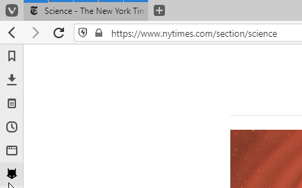
Drop Down Tab Stacks
Preview
Installation
As acustom.cssmod:/* Drop-Down Tab Stacks LonM.vivaldi.net NoCopyright Reserved */ /* A Tab group is presented as a normal tab header, but with a group of "indicators" positioned above the tab header in a horizontal fashion. On hover, we want to make these vertical, show the title of the indicator, and drop them down below the existing tab header. Toggle the comments on lines (62,63) and (65) to change how long tab texts are displayed. */ /* Make the tab group indicator vertical below tab header */ .tab-group:hover .tab-group-indicator { flex-direction: column; position: relative; } /* Prevent CSS Hover Spam if mouse is above tab header */ .tab-group:hover .tab-group-indicator:before { content: ''; height: 1px; width: calc(100% - 4px); position: absolute; left: 0px; background-color: var(--colorBg); border: 1px solid transparent; } /* Space tab indicators vertically */ .tab-group:hover .tab-indicator { height: 30px !important; margin-top: 2px; } /* Background (shape) of tab indicator */ .tab-group:hover .tab-indicator:before { content: ''; background: var(--colorBgInverser); display: flex; height: 26px; width: 172px; border-radius: var(--radiusHalf); } /* Foreground (text) of tab indicator */ .tab-group:hover .tab-indicator:after { content: attr(title); display: block; width: 168px; position: relative; top: -20px; left: 4px; color: var(--colorFg); white-space: nowrap; overflow: hidden; /** Toggle for fade out long text */ -webkit-mask-image: -webkit-linear-gradient(180deg, transparent 0, #fff 16px); -webkit-mask-position: top right; /* or clip with ... */ /*text-overflow: ellipsis;*/ } .tab-group:hover .tab-indicator { background: transparent !important; } /* Highlight Currently selected tab group indicator */ .tab-group:hover .tab-indicator.active { height: 26px; width: 172px; border-bottom: 1px solid var(--colorAccentBg) !important; border-radius: var(--radiusHalf); background: transparent !important; } /* Change active indicator colours */ .tab-group:hover .tab-indicator:hover:before { background: var(--colorHighlightBg); } .tab-group:hover .tab-indicator:hover:after { color: var(--colorHighlightFg); } /* different tab positions */ .tabs-right .tab-group:hover .tab-group-indicator, .tabs-left .tab-group:hover .tab-group-indicator{ top: 30px !important; bottom: unset !important; } .tabs-right .tab-group:hover .tab-group-indicator:before, .tabs-left .tab-group:hover .tab-group-indicator:before{ top: -27px; bottom: unset !important; } .tabs-top .tab-group:hover .tab-group-indicator{ top: 26px !important; bottom: unset !important; left: -6px; } .tabs-top .tab-group:hover .tab-group-indicator:before { top: -30px; bottom: unset !important; left: 6px; width: calc(100% - 10px); } .tabs-bottom .tab-group:hover .tab-group-indicator{ top: unset !important; bottom: 26px !important; } .tabs-bottom .tab-group:hover .tab-group-indicator:before { top: unset !important; bottom: -30px; } /* Prevent side tabs z-index upsetting the layering of the tab group indicators */ .tabs-right .tab-position:hover, .tabs-left .tab-position:hover { z-index: 3 !important; }Config
You can toggle commenting the lines/** Toggle for fade out long text */ -webkit-mask-image: -webkit-linear-gradient(180deg, transparent 0, #fff 16px); -webkit-mask-position: top right; /* or clip with ... */ /*text-overflow: ellipsis;*/To change how the tab text is cut off if it is too long.
You can change how wide the tab stack item is shown as by changing the lines
.tab-group:hover .tab-indicator:before {
  width: 172px;
}
/* and */
.tab-group:hover .tab-indicator:after {
  width: 168px;
}
Note that the second width must be 4px less than the first.
Usage
If you have tabs on top and visual previews disabled, you can use this drop-down.Bugs
- Moving tabs around in the tab stack by dragging does not work with tabs to the side
- Moving tabs around in the tab stack by dragging is temperamental with tabs on top or bottom
- Tabs do not display in full width if set to the side with a very narrow tab strip width
Updates
r2: Support all tab locations, Highlight last selected tab stack item, Minor cosmetic improvements
r1: Initial Release💻 Windows 10 64-bit Sopranos Builds • en-GB • 🗳 vote for features • 🕵️♀️ Code of Conduct • 🐞 Report bugs
-
@lonm you have to upload the image using the cloud icon here.
-
-
@lonm any chance you could get this working nicely for tabs on the side?
-
@narsis I've updated the mod and it should work better now.
-
@raed If you think of the cloud icon in the tab bar, it means that sync is enabled and running.
-
@lonm thanks!

-
@raed When I have the Vivaldi sync experiment turned on on two separate devices, I can use that
 icon to see the tabs on the other device.
 -
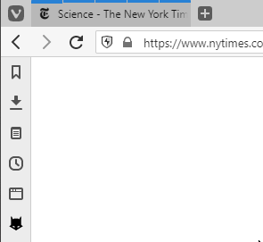
In the spirit of learning I gave it a more of a dropdown menu look and it can now be used with thumbnails active. Except for bottom tabs, for some reason they don't like to stay on the background.
Here are the changes:
- Added .tab-strip to avoid messing with popup thumbnails background.
- Added z-index for tab position to work with thumbnails enabled.
- General graphic changes to make it look like a regular dropdown menu.
- Changed many fixed sizes to %.
- Added shadows.
- Added opening animation.
- Added animation for popups in case someone is using them.
/* Drop-Down Tab Stacks LonM.vivaldi.net NoCopyright Reserved */ /* A Tab group is presented as a normal tab header, but with a group of "indicators" positioned above the tab header in a horizontal fashion. On hover, we want to make these vertical, show the title of the indicator, and drop them down below the existing tab header. Toggle the comments on lines (62,63) and (65) to change how long tab texts are displayed. */ /* Mod 01 OA 04/08/18 - Added .tab-strip to avoid messing with popup thumbnails background. - Added z-index for tab position to work with thumbnails enabled. - General graphic changes to make it look like a regular dropdown menu. - Added shadows. - Added opening animation. - Added animation for popups in case someone is using them. */ /* Change the color of tab groups to improve visibility */ .tab-strip .tab-group{ background: var(--colorBgDark) !important; color: var(--colorFgIntense) !important; } .tab-strip .tab-group.active{ background: var(--colorAccentBgDark) !important; color: var(--colorAccentFg) !important; } .tab-strip .tab-group:hover{ background: var(--colorBgDarker) !important; color: var(--colorFgIntenser) !important; } .tab-strip .tab-group.active:hover{ background: var(--colorAccentBgDarker) !important; color: var(--colorAccentFg) !important; } /* Fixes issues with Thumbnails */ .tab-strip .tab-position:hover { z-index: 17 !important; } /* Make the tab group indicator vertical below tab header */ .tab-group:hover .tab-group-indicator { flex-direction: column; position: relative; top: 30px !important; padding-bottom: 8px; background: var(--colorBg); border-bottom-left-radius: var(--radiusHalf); border-bottom-right-radius: var(--radiusHalf); box-shadow: 0 4px 8px 0 rgba(0, 0, 0, 0.2), 0 6px 13px 0 rgba(0, 0, 0, 0.19); transition: 50ms ease-out; } /* Prevent CSS Hover Spam if mouse is above tab header */ .tab-group:hover .tab-group-indicator:before { content: ''; height: 1px; width: calc(100% - 4px); position: absolute; left: 0px; background-color: var(--colorBg); border: 1px solid transparent; } /* Space tab indicators vertically */ .tab-group:hover .tab-indicator { height: 30px !important; margin: 0px !important; background-color: transparent !important; } /* Background (shape) of tab indicator */ .tab-group:hover .tab-indicator:before { content: ''; background: var(--colorBg); display: flex; height: 100%; width: 100%; border-radius: var(--radiusThird); } /* Background (shape) of active tab indicator */ .tab-group:hover .tab-indicator.active:before{ background: var(--colorAccentBg); } /* Foreground (text) of tab indicator */ .tab-group:hover .tab-indicator:after { content: attr(title); display: block; width: calc(100% - 4px); position: relative; top: -20px; left: 6px; color: var(--colorFg); white-space: nowrap; overflow: hidden; /** Toggle for fade out long text */ -webkit-mask-image: -webkit-linear-gradient(180deg, transparent 0, #fff 16px); -webkit-mask-position: top right; /* or clip with ... */ /*text-overflow: ellipsis;*/ } /* Foreground (text) of active tab indicator */ .tab-group:hover .tab-indicator.active:after { color: var(--colorAccentFg); } /* Change active indicator colours */ .tab-group:hover .tab-indicator:hover:before { background: var(--colorHighlightBg); } .tab-group:hover .tab-indicator:hover:after { color: var(--colorHighlightFg); } /* different tab positions */ .tabs-right .tab-group:hover .tab-group-indicator, .tabs-left .tab-group:hover .tab-group-indicator{ top: 37px !important; bottom: unset !important; } /* .tabs-right .tab-group:hover .tab-group-indicator:before, .tabs-left .tab-group:hover .tab-group-indicator:before{ top: -37px; bottom: unset !important; } .tabs-top .tab-group:hover .tab-group-indicator{ top: 26px !important; bottom: unset !important; left: -6px; } .tabs-top .tab-group:hover .tab-group-indicator:before { top: -30px; bottom: unset !important; left: 6px; width: calc(100% - 10px); } */ .tabs-bottom .tab-group:hover .tab-group-indicator{ top: unset !important; bottom: 30px !important; border-top-left-radius: var(--radiusHalf); border-top-right-radius: var(--radiusHalf); border-bottom-left-radius: 0; border-bottom-right-radius: 0; box-shadow: 0 -2px 6px 0 rgba(0, 0, 0, 0.2); } .tabs-bottom .tab-group:hover .tab-group-indicator:before { top: unset !important; bottom: -30px; } /* Prevent side tabs z-index upsetting the layering of the tab group indicators */ .tabs-right .tab-position:hover, .tabs-left .tab-position:hover { z-index: 3 !important; } /* Changes to popup thumbnails */ /* Inital settings */ #vivaldi-tooltip .tooltip .tooltip-item { top: 0px; width: calc(226px/1.13); /* Default = 226px */ margin: 0 2px 10px 2px; transition: 100ms ease; } /* Smaller Thumbnails Default = 160px */ #vivaldi-tooltip .tooltip .tooltip-item .thumbnail-image { height: calc(160px/2); } /* Coloring last active */ #vivaldi-tooltip .tooltip .tooltip-item.last-active { top: 0px; color: var(--colorAccentFg); background-color: var(--colorAccentBgFaded); } /* Highlighting thumbnail under mouse */ #vivaldi-tooltip .tooltip .tab-group .tooltip-item:hover { top: 10px; background-color: var(--colorAccentBgFadedMost); color: var(--colorAccentFg); } /* Fix for right tabs */ .tabs-right ~ #vivaldi-tooltip .tooltip .tooltip-item{ width: calc(226px/1); } /* Fix for bottom tabs */ .tabs-bottom ~ #vivaldi-tooltip .tooltip .tab-group .tooltip-item:hover { top: -10px; } -
@oandreaus
Good changes! The drop-down looks a lot nicer now.Personally, I'm not a fan of the additional colour to tab groups, but I agree there needs to be some sort of indicator that a tab is actually a group, as it's not very visible otherwise. I have made some changes:
Changelog
- Added @oandreaus to file header
- Fix slight offset in side tabs causing hover issues
- Make thumb hover animations obey user setting
- Improve contrast of thumb hover text in light theme
/*
Drop-Down Tab Stacks
lonm.vivaldi.net
oandreaus.vivaldi.net
No Copyright Reserved
*/

/*
A Tab group is presented as a normal tab header,
but with a group of "indicators" positioned above
the tab header in a horizontal fashion.
On hover, we want to make these vertical, show
the title of the indicator, and drop them down
below the existing tab header.
Toggle the comments in .tab-group:hover .tab-indicator:after
to change how long tab texts are displayed.
*/

/*
Mod 02 LM 2018-APR-08
- Fix slight offset in side tabs causing hover issues
- Make thumb hover animations obey user setting
- Improve contrast of thumb hover text in light theme
*/

/*
Mod 01 OA 04/08/18
- Added .tab-strip to avoid messing with popup thumbnails background.
- Added z-index for tab position to work with thumbnails enabled.
- General graphic changes to make it look like a regular dropdown menu.
- Added shadows.
- Added opening animation.
- Added animation for popups in case someone is using them.
*/


/* Change the color of tab groups to improve visibility */
.tab-strip .tab-group{
  background: var(--colorBgDark) !important;
  color: var(--colorFgIntense) !important;
}
.tab-strip .tab-group.active{
  background: var(--colorAccentBgDark) !important;
  color: var(--colorAccentFg) !important;
}

.tab-strip .tab-group:hover{
  background: var(--colorBgDarker) !important;
  color: var(--colorFgIntenser) !important;
}
.tab-strip .tab-group.active:hover{
  background: var(--colorAccentBgDarker) !important;
  color: var(--colorAccentFg) !important;
}

/* Fixes issues with Thumbnails */
.tab-strip .tab-position:hover {
  z-index: 17 !important;
}

/* Make the tab group indicator vertical below tab header */
.tab-group:hover .tab-group-indicator {
  flex-direction: column;
  position: relative;
  top: 30px !important;
  padding-bottom: 8px;
  background: var(--colorBg);
  border-bottom-left-radius: var(--radiusHalf);
  border-bottom-right-radius: var(--radiusHalf);
  box-shadow: 0 4px 8px 0 rgba(0, 0, 0, 0.2), 0 6px 13px 0 rgba(0, 0, 0, 0.19);
  transition: 50ms ease-out;
}

/* Prevent CSS Hover Spam if mouse is above tab header */
.tab-group:hover .tab-group-indicator:before {
  content: '';
  height: 1px;
  width: calc(100% - 4px);
  position: absolute;
  left: 0px;
  background-color: var(--colorBg);
  border: 1px solid transparent;
}


/* Space tab indicators vertically */
.tab-group:hover .tab-indicator {
  height: 30px !important;
  margin: 0px !important;
  background-color: transparent !important;
}

/* Background (shape) of tab indicator */
.tab-group:hover .tab-indicator:before {
  content: '';
  background: var(--colorBg);
  display: flex;
  height: 100%;
  width: 100%;
  border-radius: var(--radiusThird);
}

/* Background (shape) of active tab indicator */
.tab-group:hover .tab-indicator.active:before{
  background: var(--colorAccentBg);
}


/* Foreground (text) of tab indicator */
.tab-group:hover .tab-indicator:after {
  content: attr(title);
  display: block;
  width: calc(100% - 4px);
  position: relative;
  top: -20px;
  left: 6px;
  color: var(--colorFg);
  white-space: nowrap;
  overflow: hidden;
  /** Toggle for fade out long text */
  -webkit-mask-image: -webkit-linear-gradient(180deg, transparent 0, #fff 16px);
  -webkit-mask-position: top right;
  /*  or clip with ... */
  /*text-overflow: ellipsis;*/
}

/* Foreground (text) of active tab indicator */
.tab-group:hover .tab-indicator.active:after {
  color: var(--colorAccentFg);
}

/* Change active indicator colours */
.tab-group:hover .tab-indicator:hover:before {
  background: var(--colorHighlightBg);
}
.tab-group:hover .tab-indicator:hover:after {
  color: var(--colorHighlightFg);
}


/* different tab positions */
.tabs-right .tab-group:hover .tab-group-indicator,
.tabs-left  .tab-group:hover .tab-group-indicator{
  top: 36px !important;
  bottom: unset !important;
}

.tabs-bottom .tab-group:hover .tab-group-indicator{
  top: unset !important;
  bottom: 30px !important;
  border-top-left-radius: var(--radiusHalf);
  border-top-right-radius: var(--radiusHalf);
  border-bottom-left-radius: 0;
  border-bottom-right-radius: 0;
  box-shadow: 0 -2px 6px 0 rgba(0, 0, 0, 0.2);
}
.tabs-bottom .tab-group:hover .tab-group-indicator:before {
  top: unset !important;
  bottom: -30px;
}

/* Prevent side tabs z-index upsetting the
 layering of the tab group indicators */
.tabs-right .tab-position:hover,
.tabs-left  .tab-position:hover {
  z-index: 3 !important;
}


/*

Changes to popup thumbnails

*/

/* Inital settings */
#vivaldi-tooltip .tooltip .tooltip-item {
  top: 0px;
  width: calc(226px/1.13); /* Default = 226px */
  margin: 0 2px 10px 2px;
  transition: 100ms ease;
}

#browser.animation-off ~ #vivaldi-tooltip .tooltip .tooltip-item {
  transition-duration: 0s !important;
}

/* Smaller Thumbnails Default = 160px */
#vivaldi-tooltip .tooltip .tooltip-item .thumbnail-image {
  height: calc(160px/2);
}

/* Coloring last active */
#vivaldi-tooltip .tooltip .tooltip-item.last-active {
  top: 0px;
  color: var(--colorAccentFg);
  background-color: var(--colorAccentBgFaded);
}

/* Highlighting thumbnail under mouse */
#vivaldi-tooltip .tooltip .tab-group .tooltip-item:hover {
  top: 10px;
  background-color: var(--colorAccentBgFadedMost);
  color: var(--colorFg);
}

/* Fix for right tabs */
.tabs-right ~ #vivaldi-tooltip .tooltip .tooltip-item{
  width: 226px;
}
/* Fix for bottom tabs */
.tabs-bottom ~ #vivaldi-tooltip .tooltip .tab-group .tooltip-item:hover {
  top: -10px;
}
Notes
I can't seem to figure out why it doesn't work with the thumbnails and tabs at the bottom either.💻 Windows 10 64-bit Sopranos Builds • en-GB • 🗳 vote for features • 🕵️♀️ Code of Conduct • 🐞 Report bugs
-
@lonm @oandreaus Cool work, I really like the stack in this way.
And works with side tabs too.
A close button would be useful for the expading stack, if easy to do.Well, actually the close button is present, is just strange to click in a different position. But it totally works.Patience Is The Key To Get The Vivaldi Spree | Unsupported Extensions | Github | w11 + Kde Manjaro + Android 13
-
@hadden89 I believe it wouldn't be possible to have a close button for each tab in a stack (if that's what you meant) without converting this into a JS mod
💻 Windows 10 64-bit Sopranos Builds • en-GB • 🗳 vote for features • 🕵️♀️ Code of Conduct • 🐞 Report bugs
-
@lonm Yup.
Actually I'm not a big fan of stacked tabs.
But I will merge this in my css as I like more than default way
-
This broke in snapshot Vivaldi 2.5.1504.6 / Chrome 73.0.3683.88 so I uploaded a fixed version:
/*
Drop-Down Tab Stacks
lonm.vivaldi.net
oandreaus.vivaldi.net
No Copyright Reserved
*/

/*
A Tab group is presented as a normal tab header,
but with a group of "indicators" positioned above
the tab header in a horizontal fashion.
On hover, we want to make these vertical, show
the title of the indicator, and drop them down
below the existing tab header.
Toggle the comments in .tab-group:hover .tab-indicator:after
to change how long tab texts are displayed.
*/

/*
LM 2019-04-03
Fix positioning issue with snapshot Vivaldi 2.5.1504.6 / Chrome 73.0.3683.88

Mod 02 LM 2018-APR-08
- Fix slight offset in side tabs causing hover issues
- Make thumb hover animations obey user setting
- Improve contrast of thumb hover text in light theme
*/

/*
Mod 01 OA 04/08/18
- Added .tab-strip to avoid messing with popup thumbnails background.
- Added z-index for tab position to work with thumbnails enabled.
- General graphic changes to make it look like a regular dropdown menu.
- Added shadows.
- Added opening animation.
- Added animation for popups in case someone is using them.
*/


/* Change the color of tab groups to improve visibility */
/*.tab-strip .tab-group{
  background: var(--colorBgDark) !important;
  color: var(--colorFgIntense) !important;
}
.tab-strip .tab-group.active{
  background: var(--colorAccentBgDark) !important;
  color: var(--colorAccentFg) !important;
}

.tab-strip .tab-group:hover{
  background: var(--colorBgDarker) !important;
  color: var(--colorFgIntenser) !important;
}
.tab-strip .tab-group.active:hover{
  background: var(--colorAccentBgDarker) !important;
  color: var(--colorAccentFg) !important;
}*/

/* Fixes issues with Thumbnails */
.tab-strip .tab-position:hover {
  z-index: 17 !important;
}

/* fix positioning problem in snapshot */
.stacks-on .tab-strip .tab .tab-group-indicator {
  position: absolute;
}

/* Make the tab group indicator vertical below tab header */
.tab-group:hover .tab-group-indicator {
  flex-direction: column;
  position: relative;
  top: 30px !important;
  padding-bottom: 8px;
  background: var(--colorBg);
  border-bottom-left-radius: var(--radiusHalf);
  border-bottom-right-radius: var(--radiusHalf);
  box-shadow: 0 4px 8px 0 rgba(0, 0, 0, 0.2), 0 6px 13px 0 rgba(0, 0, 0, 0.19);
  transition: 50ms ease-out;
}

/* Prevent CSS Hover Spam if mouse is above tab header */
.tab-group:hover .tab-group-indicator:before {
  content: '';
  height: 1px;
  width: calc(100% - 4px);
  position: absolute;
  left: 0px;
  background-color: var(--colorBg);
  border: 1px solid transparent;
}


/* Space tab indicators vertically */
.tab-group:hover .tab-indicator {
  height: 30px !important;
  margin: 0px !important;
  background-color: transparent !important;
}

/* Background (shape) of tab indicator */
.tab-group:hover .tab-indicator:before {
  content: '';
  background: var(--colorBg);
  display: flex;
  height: 100%;
  width: 100%;
  border-radius: var(--radiusThird);
}

/* Background (shape) of active tab indicator */
.tab-group:hover .tab-indicator.active:before{
  background: var(--colorAccentBg);
}


/* Foreground (text) of tab indicator */
.tab-group:hover .tab-indicator:after {
  content: attr(title);
  display: block;
  width: calc(100% - 4px);
  position: relative;
  top: -20px;
  left: 6px;
  color: var(--colorFg);
  white-space: nowrap;
  overflow: hidden;
  /** Toggle for fade out long text */
  -webkit-mask-image: -webkit-linear-gradient(180deg, transparent 0, #fff 16px);
  -webkit-mask-position: top right;
  /*  or clip with ... */
  /*text-overflow: ellipsis;*/
}

/* Foreground (text) of active tab indicator */
.tab-group:hover .tab-indicator.active:after {
  color: var(--colorAccentFg);
}

/* Change active indicator colours */
.tab-group:hover .tab-indicator:hover:before {
  background: var(--colorHighlightBg);
}
.tab-group:hover .tab-indicator:hover:after {
  color: var(--colorHighlightFg);
}


/* different tab positions */
.tabs-right .tab-group:hover .tab-group-indicator,
.tabs-left  .tab-group:hover .tab-group-indicator{
  top: 36px !important;
  bottom: unset !important;
}

.tabs-bottom .tab-group:hover .tab-group-indicator{
  top: unset !important;
  bottom: 30px !important;
  border-top-left-radius: var(--radiusHalf);
  border-top-right-radius: var(--radiusHalf);
  border-bottom-left-radius: 0;
  border-bottom-right-radius: 0;
  box-shadow: 0 -2px 6px 0 rgba(0, 0, 0, 0.2);
}
.tabs-bottom .tab-group:hover .tab-group-indicator:before {
  top: unset !important;
  bottom: -30px;
}

/* Prevent side tabs z-index upsetting the
 layering of the tab group indicators */
.tabs-right .tab-position:hover,
.tabs-left  .tab-position:hover {
  z-index: 3 !important;
}


/*

Changes to popup thumbnails

*/

/* Inital settings */
#vivaldi-tooltip .tooltip .tooltip-item {
  top: 0px;
  width: calc(226px/1.13); /* Default = 226px */
  margin: 0 2px 10px 2px;
  transition: 100ms ease;
}

#browser.animation-off ~ #vivaldi-tooltip .tooltip .tooltip-item {
  transition-duration: 0s !important;
}

/* Smaller Thumbnails Default = 160px */
#vivaldi-tooltip .tooltip .tooltip-item .thumbnail-image {
  height: calc(160px/2);
}

/* Coloring last active */
#vivaldi-tooltip .tooltip .tooltip-item.last-active {
  top: 0px;
  color: var(--colorAccentFg);
  background-color: var(--colorAccentBgFaded);
}

/* Highlighting thumbnail under mouse */
#vivaldi-tooltip .tooltip .tab-group .tooltip-item:hover {
  top: 10px;
  background-color: var(--colorAccentBgFadedMost);
  color: var(--colorFg);
}

/* Fix for right tabs */
.tabs-right ~ #vivaldi-tooltip .tooltip .tooltip-item{
  width: 226px;
}
/* Fix for bottom tabs */
.tabs-bottom ~ #vivaldi-tooltip .tooltip .tab-group .tooltip-item:hover {
  top: -10px;
}
💻 Windows 10 64-bit Sopranos Builds • en-GB • 🗳 vote for features • 🕵️♀️ Code of Conduct • 🐞 Report bugs
-
@LonM Very nice work thank you. Happily this seems still operational in current Snapshot 3.3.2022.23 / Chrome 85.0.4183.84, with my tabs vertically on the rhs.
I've aspired for years to find a way to have the active tab thumbnail highlighted in some way when part of a stack.
- If i use a light theme [which generally i don't], i get my visual feedback via the active tab thumbnail's title font becoming clearly lighter than the others & in the extreme case [ie, the very lightest of themes] it vanishes, thus providing an unambiguous indicator.

- Sadly, in my preferred dark themes, the visual feedback is waaaaaaaaaaaaaaay more subtle, to the point where for all practical purposes there's none. I tried ignorantly cluelessly randomly editing a few parts of the css to try to make it better, but naturally i failed [it's now back to original].

♀ 🇦🇺
-
@Steffie It's completely unreadable on a light theme... did this mod do that? oops.

It can be corrected in any theme by adding this rule:
.last-active .thumbnail-text {
    text-decoration: underline;
}
(the above example adds an underline, you could change the
colorif you wanted)💻 Windows 10 64-bit Sopranos Builds • en-GB • 🗳 vote for features • 🕵️♀️ Code of Conduct • 🐞 Report bugs
-
@Steffie You should be interested in that lines, you can copy them into a separate file and change colors:
/* Coloring last active */
#vivaldi-tooltip .tooltip .tooltip-item.last-active {
  top: 0px;
  color: var(--colorAccentFg);
  background-color: var(--colorAccentBgFaded);
}
Also, guys, let me share
tab-stack-dropdown.cssI use with my changes:
The only issue I cannot overcome is native tooltips, once mouse hovers a tooltip the menu disappears:
/*
Drop-Down Tab Stacks
lonm.vivaldi.net
oandreaus.vivaldi.net
2020 [email protected]
No Copyright Reserved
*/

/*
A Tab group is presented as a normal tab header,
but with a group of "indicators" positioned above
the tab header in a horizontal fashion.
On hover, we want to make these vertical, show
the title of the indicator, and drop them down
below the existing tab header.
Toggle the comments in .tab-group:hover .tab-indicator:after
to change how long tab texts are displayed.
*/

/*
LM 2019-04-03
Fix positioning issue with snapshot Vivaldi 2.5.1504.6 / Chrome 73.0.3683.88

Mod 02 LM 2018-APR-08
- Fix slight offset in side tabs causing hover issues
- Make thumb hover animations obey user setting
- Improve contrast of thumb hover text in light theme
*/

/*
Mod 01 OA 04/08/18
- Added .tab-strip to avoid messing with popup thumbnails background.
- Added z-index for tab position to work with thumbnails enabled.
- General graphic changes to make it look like a regular dropdown menu.
- Added shadows.
- Added opening animation.
- Added animation for popups in case someone is using them.
*/


/* Change the color of tab groups to improve visibility */
.tab-strip .tab-group{
  background: var(--colorAccentBgDark);
  color: var(--colorFgIntense) !important;
}
.tab-strip .tab-group.active{
  background: var(--colorAccentBgDark) !important;
  color: var(--colorAccentFg) !important;
}

.tab-strip .tab-group:hover{
  background: var(--colorBgDarker) !important;
  color: var(--colorFgIntenser) !important;
}
.tab-strip .tab-group.active:hover{
  background: var(--colorAccentBgDarker) !important;
  color: var(--colorAccentFg) !important;
}

/* Fixes issues with Thumbnails */
.tab-strip .tab-position:hover {
  z-index: 17 !important;
}

/* fix positioning problem in snapshot */
.stacks-on .tab-strip .tab .tab-group-indicator {
  position: absolute;
}

/* Make the tab group indicator vertical below tab header */
.tab-group:hover .tab-group-indicator {
  flex-direction: column;
  position: relative;
  top: 30px !important;
  /* padding-bottom: 8px; */
  background: var(--colorBg);
  border-bottom-left-radius: var(--radiusHalf);
  border-bottom-right-radius: var(--radiusHalf);
  box-shadow: 0 4px 8px 0 rgba(0, 0, 0, 0.2), 0 6px 13px 0 rgba(0, 0, 0, 0.19);
  /* transition: 50ms ease-out; */
  min-width: 256px;
}

/* Prevent CSS Hover Spam if mouse is above tab header */
.tab-group:hover .tab-group-indicator:before {
  /* content: ''; */
  height: 1px;
  width: calc(100% - 4px);
  position: absolute;
  left: 0px;
  background-color: var(--colorBg);
  border: 1px solid transparent;
}


/* Space tab indicators vertically */
.tab-group:hover .tab-indicator {
  height: 32px !important;
  margin: 0px !important;
  background-color: transparent !important;
  flex: auto;
  padding: 0 !important;
  border: 0 !important;
  transition-property: height;
  /* transition: 80ms ease-out; */
  transition: 80ms cubic-bezier(0.18, 0.89, 0.32, 1.28);
  min-height: 26px;
  position: relative;
}

/* Background (shape) of tab indicator */
.tab-group:hover .tab-indicator:before {
  content: '';
  background: var(--colorBg);
  display: flex;
  height: 100%;
  width: 100%;
  border-radius: var(--radiusThird);
}

/* Background (shape) of active tab indicator */
.tab-group:hover .tab-indicator.active:before{
  background: var(--colorAccentBg);
}


/* Foreground (text) of tab indicator */
.tab-group:hover .tab-indicator:after {
  content: attr(title);
  display: block;
  width: calc(100% - 4px);
  /* position: relative; */
  position: absolute;
  top: 8px;
  left: 6px;
  color: var(--colorFg);
  white-space: nowrap;
  overflow: hidden;
  /** Toggle for fade out long text */
  -webkit-mask-image: -webkit-linear-gradient(180deg, transparent 0, #fff 16px);
  -webkit-mask-position: top right;
  /*  or clip with ... */
  /*text-overflow: ellipsis;*/
}

/* Foreground (text) of active tab indicator */
.tab-group:hover .tab-indicator.active:after {
  color: var(--colorAccentFg);
}

/* Change active indicator colours */
.tab-group:hover .tab-indicator:hover:before {
  background: var(--colorHighlightBg);
}
.tab-group:hover .tab-indicator:hover:after {
  color: var(--colorHighlightFg);
}


/* different tab positions */
.tabs-right .tab-group:hover .tab-group-indicator,
.tabs-left  .tab-group:hover .tab-group-indicator{
  top: 36px !important;
  bottom: unset !important;
}

.tabs-bottom .tab-group:hover .tab-group-indicator{
  top: unset !important;
  bottom: 30px !important;
  border-top-left-radius: var(--radiusHalf);
  border-top-right-radius: var(--radiusHalf);
  border-bottom-left-radius: 0;
  border-bottom-right-radius: 0;
  box-shadow: 0 -2px 6px 0 rgba(0, 0, 0, 0.2);
}
.tabs-bottom .tab-group:hover .tab-group-indicator:before {
  top: unset !important;
  bottom: -30px;
}

/* Prevent side tabs z-index upsetting the
 layering of the tab group indicators */
.tabs-right .tab-position:hover,
.tabs-left  .tab-position:hover {
  z-index: 3 !important;
}


/*

Changes to popup thumbnails

*/

/* Inital settings */
#vivaldi-tooltip .tooltip .tooltip-item {
  top: 0px;
  width: calc(226px/1.13); /* Default = 226px */
  margin: 0 2px 10px 2px;
  transition: 100ms ease;
}

#browser.animation-off ~ #vivaldi-tooltip .tooltip .tooltip-item {
  transition-duration: 0s !important;
}

/* Smaller Thumbnails Default = 160px */
#vivaldi-tooltip .tooltip .tooltip-item .thumbnail-image {
  height: calc(160px/2);
}

/* Coloring last active */
#vivaldi-tooltip .tooltip .tooltip-item.last-active {
  top: 0px;
  color: var(--colorAccentFg);
  background-color: var(--colorAccentBgFaded);
}

/* Highlighting thumbnail under mouse */
#vivaldi-tooltip .tooltip .tab-group .tooltip-item:hover {
  top: 10px;
  background-color: var(--colorAccentBgFadedMost);
  color: var(--colorFg);
}

/* Fix for right tabs */
.tabs-right ~ #vivaldi-tooltip .tooltip .tooltip-item{
  width: 226px;
}
/* Fix for bottom tabs */
.tabs-bottom ~ #vivaldi-tooltip .tooltip .tab-group .tooltip-item:hover {
  top: -10px;
}

/* Change tab stack indicator color */
.color-behind-tabs-on.stacks-on .tab-strip .tab .tab-group-indicator .tab-indicator {
  background-color: var(--colorBorderHighlight);
}