Underlines in 1.14.1072.3
-
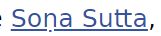
Since upgrading to 1.14.1072.3, underlines are now rendered closer to the letters, and are interrupted by letters that hang below the baseline (such as g,p,y etc.). This makes them more distracting - is there any way to get the old underline rendering back?
-
it's a change in Chromium 64
https://groups.google.com/a/chromium.org/forum/#!topic/blink-dev/47BHtmz0jVY -
-
I personally find it more nice this way, the letters are not "cut" anymore
http://iancoog.altervista.org/
--=[]=-----------------------------------------------------------------------=[]=--
Windows10 64bits - 8core i9-9900K @ 3.60GHz - 16Gb RAM - nVidia GT1030 -
Solved with user CSS. Much better now.
-
@ian-coog Me too. It is one of those minor things that users will quickly become accustomed to, then wonder why it was not always thus.
Edit: I already prefer it because it makes it much easier to see if a consonant has a diacritic dot below or not.
-
@rand256 There are a few issues with it. Turning it off with CSS is the best solution for now. It might be a while before we see a checkbox in Settings, Webpages for this. The weight of the underlining is also too heavy for many fonts.
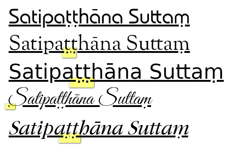
OK for Mandala (top) and Verajja (third), but not so good for lighter fonts.
-
 P pafflick moved this topic from Vivaldi for Windows on
