New Forum Header
-
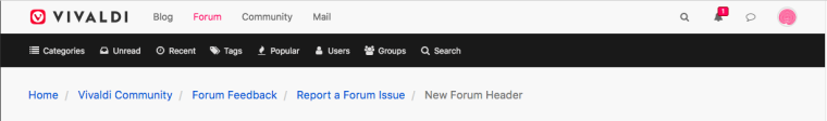
Why release a clearly not finished new forum header into the wild? It's nice that you integrated the new logo, but there are so many inconsistencies and mistakes, it's not professional.
Eg....
- The header is 20px higher, which is bad for users with smaller screens and lower resolution.
- The highlight behind the dropdown buttons (notifications, messages, profile) just floats in mid air, and the start of the dropdown itself isn't aligned with the menuwrapper anymore.
- The highlight of the menuwrapper items (categories, unread, recent, etc) is misaligned.
I'm sure that's not all, but it's already enough. I hope there's a fix coming up soon. The same care that is taken protecting users from unfinished products (mail,sync) in the browser, should be taken when changes are made to the Vivaldi forum. Even more so, because these changes are only cosmetic, no one needs them and they don't introduce additional functionality.
-
@luetage At anything over 100% zoom the search field wraps to the next line. I use a 1200 x 1600 portrait monitor at 120% default webpage zoom.

Blog • Vivaldi Review • Server Status
Specs: AMD Ryzen 5 3400G, 8 Gb • Win 10 64-bit build 19045.2486 • Snapshot 6.7.3329.9 (64-bit) -
@pesala True, but that's an old bug. Now it just happens much sooner, because there are more items in the header. Additionally the upper part of the search field is still visible, because we have more vertical space, whereas it used to be completely hidden behind the menuwrapper in previous versions.
-
Version with old height and decreased number of links.
-
Same happens to me, I have to decrease the zoom value.