Vivaldi 1.11 – Focus on accessibility
-
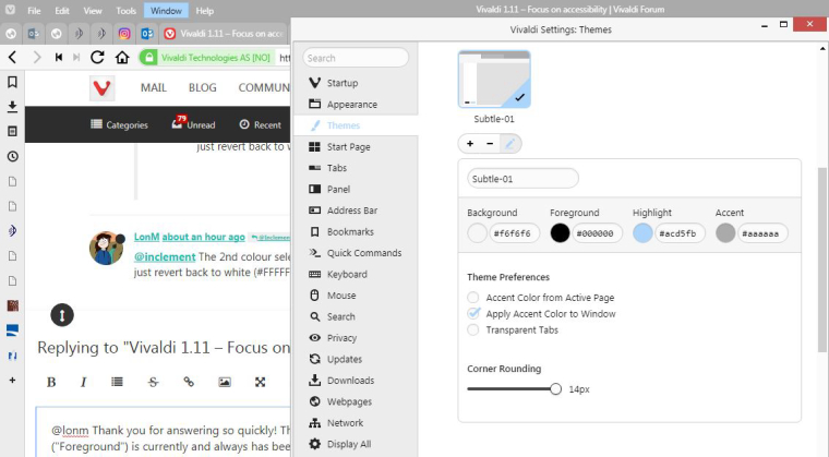
@lonm Thank you for answering so quickly!
The second color selector ("Foreground") is currently and always has been set to #000000. It's just that after I upgraded, it doesn't appear as black in the browser, it appears as white.
Here's a screen clip, simultaneously showing the settings and the displayed color.
-
@lonm Did I goof up replying and mess up this thread?? Sorry...

-
@inclement Are you trying to say there's white text on a white background there? I appear to be clearly seeing black text (#000000). It you're talking about the text on the tabs, that appears to be a contrast judgment that Vivaldi makes. It will not allow you to have black text on a background that it thinks is too dark, and so it reverses it.
My setup does the same thing. It shows all foreground markings and text as black (#000000) except on my tabs, which are a dark color (#407630), and on those, it shows text as white. (Except the active tab, which is white, and so the text is black).
-
@ayespy He's referring to the "Vivaldi menu text" and "tab title text"
Could this be related to the "Apply Accent Colour To Window" setting which affects the squircle as explained :-
@atlemo said in Vivaldi 1.11 – Focus on accessibility:
@tbgbe: Themes using
Apply Accent Color to Windowwill get a monochrome version of the icon, in this case black (changes to white depending on luminecense). This is to make sure it's legible for all the possible background colors.Win: Snapshot Vivaldi 6.7.3329.9
-
@ayespy Yes, I'm talking about the text on the tabs, and also the menu headings. If it is making a contrast judgement, it wasn't doing that until I downloaded [more accurately, updated to] 1.11. I guess I think if we set up a custom theme it shouldn't override what we tell it...defeats the purpose of customizing...
-
@tbgbe Right. It doesn't matter what you set those to if the background color is too dark. The browser will show them as white. 1.11 does have new contrast settings - and it doesn't entirely defeat customization. It just errs in the direction of visibility. The effect can be reduced with slight color changes and with making sure that you do not have any enhanced contrast settings selected under Menu/Tools/Settings/Appearance /Color.
-
@inclement @Ayespy OK then, so a quick check for this "customisation problem" would be to turn off that "Apply Accent Colour to Window" setting to see the effect in your required theme?
-
@tbgbe I'm not entirely sure what that setting is intended for, but when I uncheck that box, it seems to swap the areas where the "accent" color and the "background" color are applied.
-
@ayespy @TbGbe @LonM Okay...deep breath, because I really don't want to yell at people, but there's a point to be made...do you see how this is aggravating? Make all the contrast judgements you want in the pre-defined themes. But customization shouldn't be defeated at all - it's customization. If someone wants the ugliest color combination on earth, they should be allowed to have it, and how does it hurt anything to let them?
Also, some of this is in the eye of the beholder. With my accent color of #aaaaaa, I actually think the white font color is less crisp and harder to read than the black.
Obviously that's just my opinion and others may disagree. But again, people should be allowed to do what they want in customization. "Overriding customization" is a contradiction in terms.
(Thank you for listening...)
[Added: I don't have any enhanced contrast settings selected under Setting/Appearance; it's set to "no modifications."]
-
@inclement I see were you're coming from, but you should consider that Vivaldi had to streamline the theming process. -- The fewest options possible with the widest impact. That this messes up your special case is unfortunate, but instead of complaining you could do something about it and just implement a custom modification.
Setting the text color of tabs is a really easy and fast mod. If you aren't willing to try this, you will have to wait for Vivaldi to implement an additional option to control the text color of tabs. But it's not that simple, because the color of tabs can change dramatically, if accent color from active page is activated -- who is gonna decide the text color then? Should it be written down for every possible tab background set by the application, determined by the user?
-
@inclement Your points are all valid. The one thing I can also say, with absolute certainty, is that the Designers and Developers responsible for that change had no intention of breaking your theme. The reason behind the change was to make something else better and any negative impact was unintentional.
For a quick fix, try changing your Accent colour to #acacac - it's only slightly lighter than what you had before but that should restore the black text.
The other thing that you can do is to file a bug report at https://vivaldi.com/bugreport/
Include your theme settings that worked well for you before, and pass on some friendly feedback. When you get a confirmation e-mail, reply to it and attach a copy of your screenshot. I don't think that they'll revert the change or come up with an immediate fix, but they definitely will take your feedback into consideration when they make future changes. -
@xyzzy Thanks for the #acacac suggestion - you're right, it did restore the black text.
I'll file the bug report sometime soon - and I do appreciate the simple recognition that this is indeed a bug, and unintentional.

-
@luetage I am willing to try it - I'm glad you told me it's there.
-
I am surprised that there is no "play gif on hover" or "play gif on click" feature request. This feature is awesome, but strongly degrade UX without the ability to easily play animation when needed.
-
Good afternoon. Who is the Accessibility (A11y) coordinator?
Where do we log Accessibility defects? There are a non-trivial number to address.
Sean Kelly | Senior Accessibility Engineer | Optum / United Health Group -
@seankelly Submit a Bug Report for each specific case.
-
 J jane.n moved this topic from Vivaldi Blog on
-
 P pafflick locked this topic on