Vivaldi Forum mod
-
@potmeklecbohdan I added your code to my custom CSS and it's far better now. Thanks a lot for sharing it.
-
@hlehyaric It's better than the blue one for sure, but I'm unsure if we shouldn't go for var(--colorFG) instead. The highlight color can be a bit heavy on some themes.
-
@luetage Yes, I was talking about the blue line. Anyway, Highlight and Foreground are better than the bue line, at least with my theme (I've just tried Foreground and it will be up to you to choose what sounds better
") ).
). -
@luetage I didn't test other variables than this one. But it's still something that
should beusually is highlighted. -
@potmeklecbohdan Fg is a foreground color, just like hi, link and link2. All are valid since they have enough contrast to the background.
-
Please try this:
/* progress */
#nprogress .spinner-icon {
    border-top-color: var(--colorHi);
    border-left-color: var(--colorHi);
    opacity: 0.66;
}
#nprogress .bar {
    background: var(--colorHi);
    opacity: 0.66;
}
#nprogress .peg {
    box-shadow: 0 0 10px var(--colorHi), 0 0 5px var(--colorHi);
}
It's a bit toned down – I believe it's a working solution and we would still be using the highlight color on the progress bar with matching spinner.
-
@luetage Nice, that can be.
I forgot there's the spinner because it's invisible… when I was looking for it now I found it behind the profile image. So thanks for changing also its colour.
-
This is my theme. I have simplified things to just remain blue and black
{"themeName":"Night Blue","colorBg":"#212930","colorFg":"#b3b3b3","colorHi":"#1c5ed7","colorBtn":"#1546a3","colorDrop":"#212930","colorLi":"#1080fb","colorLi2":"#3b97fc"}It is use with User CSS
#submenu { background-color: var(--colorBtn); border-bottom-color: var(--colorBtnHi); } #submenu li>a { color: var(--colorBtnFg); } #submenu a:focus, #submenu a:hover { background-color: var(--colorBtnHi); color: var(--colorBtnFg); } #submenu li.active>a { background-color: var(--colorHi); color: var(--colorHiFg); } -
@tam710562 Good one. What I recently thought about was introducing an extra class for the used theme in the body, so we can have all the additional user css we want and it is only active when the theme is in use.
So for example
.night-blue #submenu {
    background-color: var(--colorBtn);
    border-bottom-color: var(--colorBtnHi);
}
would only trigger when Night Blue is in use.
-
@luetage Good idea. But… Wouldn't it be better case sensitive? And do you know how to make difference among e. g.
Night Blue,Night-BlueandNight_Blue? -
@potmeklecbohdan CSS selectors are case insensitive as far as I know. Spaces will of course be replaced with another character, since you can't have a space in a selector. As for
_versus-… that's naturally a difference. What I'm pondering is adding acustomin front of custom themes, to make sure no theme name can interfere with an existing selector. All things to be considered. -
@luetage you can use classes that even have characters like space and
#in them, but then you need to escape them like\#and it isn't always well supported. Replacing it with a_seems like the best bet -
@luetage That's very, very, very, very, very sad. Only
custom, nottheme-custom? -
@potmeklecbohdan

-
I'm doing another rewrite of the settings right now. It's already taking longer than expected. Above mentioned changes have been implemented, but there's more to do – can't give an ETA.
But rest assured – the update is coming s0oN and getting closer every day. Just be patient already and stop pushing me sigh. So much pressure. Also there's been easter holidays and team building exercises – after which we unfortunately had to let Johnny go, because he ate all the nachos.
-
@luetage I wonder if the new version can have more than 4 themes, the best is unlimited
 and can install themes directly from the forum.
 -
@tam710562 Damn, you spoiled the surprise. Yeah, new version has "unlimited" custom themes. It's not really unlimited though, since sync storage has a limit of 100kb.
-
test post
{"themeName":"Blau","colorBg":"#23273b","colorFg":"#d4efff","colorHi":"#ffffff","colorBtn":"#68a2f2","colorDrop":"#d4efff","colorLi":"#96ffe0","colorLi2":"#d5d0fc"}
{"themeName":"Dracula","colorBg":"#282a36","colorFg":"#f8f8f2","colorHi":"#e2d774","colorBtn":"#6176a5","colorDrop":"#455182","colorLi":"#f279d0","colorLi2":"#8ce2f6"}
{"themeName":"MOR","colorBg":"#1d2225","colorFg":"#d2e0d1","colorHi":"#6bcdff","colorBtn":"#94ade6","colorDrop":"#1a2625","colorLi":"#ff6699","colorLi2":"#b1b3f0"}
{"themeName":"blackout","colorBg":"#000000","colorFg":"#000000","colorHi":"#000000","colorBtn":"#000000","colorDrop":"#000000","colorLi":"#000000","colorLi2":"#000000"}
-
That's my current theme
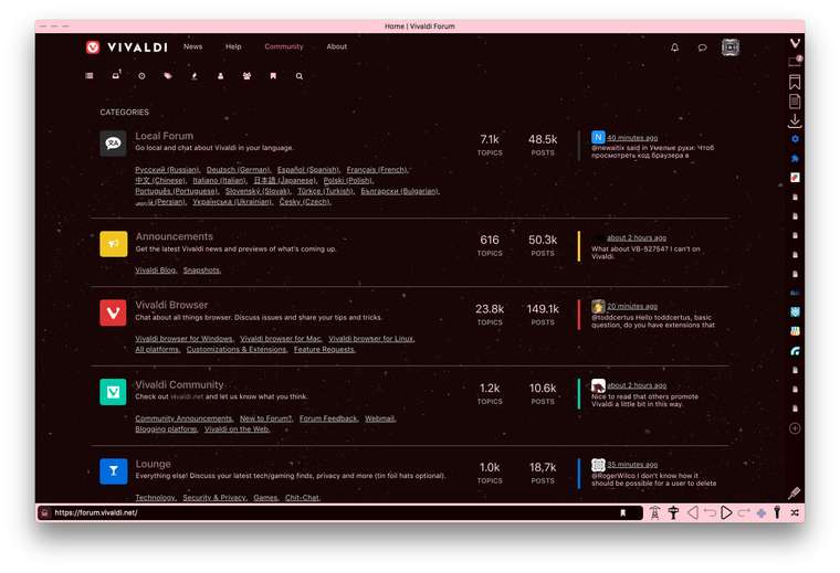
Modifications + Custom theme + UserCSS*.
{"themeName":"Stardust","colorBg":"#170706","colorFg":"#ffd4e4","colorHi":"#894e56","colorBtn":"#775b62","colorDrop":"#1b0806","colorLi":"#97797d","colorLi2":"#fcf6e0"}
Backgrond image: Transparent textures, «Stardust» by Atle Mo.
*I grabbed the CSS code in Dark Grey Theme by @sjudenim.
-
User CSS to add user status to the avatar in the header

#user-control-list .status[component="user/status"]:after {
    content: "\f111";
    top: -45px;
    right: 4px;
    position: absolute;
    visibility: visible;
    pointer-events: none;
}

#user_label .dropdown-menu {
    display: block;
    visibility: hidden;
}

#user_label.open > .dropdown-menu {
    visibility: unset;
}