Forum customization
-
As with the previous forum, I've customized a number of things to suit my preferences, and thought I'd share. If you have suggested CSS of your own, perhaps you'd like to share here, too.
Some of this may break if changes are made by the administrators to the page structure or regular CSS of the forum.
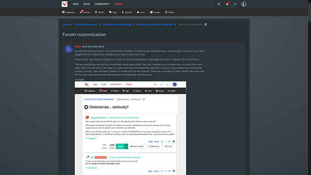
The way everything was just on a borderless white space didn't suit me; I wanted posts to look more discrete from each other and from the rest of the page, so I gave the posts moderate box shadows and put a grey background behind the content column. I also decided I preferred serifed font for the content. There are a number of other tweaks, like gear icon for the post drop-down menu and borders for thread title and tag input.
Example:

Also, I wanted alternating grey rows for lists like the categories and unread posts:

/* listings */

/* removing unnecessary/misleading hover effect; the rows aren't clickable across their areas */
.categories>li:hover, .category>ul>li:hover {
    background-color: transparent !important;
}

/* alternating row color */
.categories>li:nth-child(even), .category>ul>li:nth-child(odd) {
    background: #f5f5f5 !important;
}
.categories>li, .category>ul>li {
    margin-bottom: 0 !important;
}


/* Threads */

/* When making a post, I want lines around the Title and Tags entry fields */

.composer .title-container .title,
.bootstrap-tagsinput input,
.bootstrap-tagsinput input:focus {
    border: 1px solid #ddd !important;
}

.bootstrap-tagsinput {
    margin-top: 1ex !important;
    padding-left: 0 !important;
}


/* Instead of the nearly invisible horizontal rule seperating posts, I want clear boxes. */

li[component="post"] > hr,
.post-bar > hr {             /*hide the horizontal rule at the end of posts */
        display:none !important;
}

li[component="post"] {
    padding: 20px 10px !important; /*add padding to compensate for the new lack of the horizontal rule and its 20px+20px of margin*/
    box-shadow: 1px 1px 5px #888888 !important;
    margin-bottom: 10px !important;
}


/* That verical elipsis icon isn't great */

.fa-ellipsis-v:before {
    font-size:150% !important; /* Adjust the size to your preference and depending on the symbol chosen below. */
    vertical-align: -2px !important;

    /* content: "\2699" !important;       /* Gear */
    content:  "\f013" !important; /* FontAwesome gear. */

    /* or one of these (delete the "/*" at the beginning of one the lines to uncomment): */
    /* content: "..." !important;      /* Elipsis - "\2026" would work too, but is spaced a bit more, at least in my browser. */
    /* content: "\21E9" !important;    /* Down arrow. Use \f063 for the FontAwesome down arrow */
}


/* General */

a:hover{
    text-decoration: underline !important; /* I don't like this disabled. */
}

/* Make post content serifed */
.content {font-family:serif}


/* Show Specific datestamps, not just in tooltip.
I've applied it to just the thread view, but it
can be expanded to other instances by removing
the ".topic"s. Credit to Saskatchewan and pafflick
for original idea -- see
https://forum.vivaldi.net/post/75443    */
.topic .timeago{
    font-size:0 !important;
}
.topic .timeago::after{
    font-size: 1.2rem;
    content: attr(title);
    margin-left: 1em;
}


/* If the above is not limited to .topic
.posts-list .posts-list-item .post-info .timeago::after{
    margin-left:0
}
.posts-list .posts-list-item .post-info .post-author{
    position:relative;
    top: -35px
}
/**/


/* I prefer the links blue, at least inside the posts themselves */
.topic .posts>li .content a {
    color: #006BDA;
}


/* slight shadow for center column, and grey background for non-used far-right and far-left*/
#content {
    background: white;
    box-shadow: 1px 1px 4px #aaa;
    padding-top:20px
}
body {background: #eee !important;}
/* and match to the width-responsive rejiggering that the forum's CSS already does */
@media (max-width:767px){
	#panel {padding-top: 50px !important;}
}
@media (min-width:768px) and (max-width: 1199px){
	#panel {padding-top: 60px !important;}
}
@media (min-width:1200px){
	#panel {margin-top:70px!important;}
	body {padding-top: 40px!important;}
}


/* given the above css, in the post list, the timestamp can now extend into the gray area, so to narrow the .post-info width: */
.posts-list .posts-list-item .post-info {
    width: 100px !important;
}


/*removing unneeded padding*/
.posts-list .posts-list-item .post-body .topic-category{
    margin-bottom: 0;
}


/* Uncomment if you want the name and dates in the post list --
   e.g. https://forum.vivaldi.net/user/isildur -- to be on top of
    each excerpt
*/
/** /

.posts-list .posts-list-item .post-body{
    padding-top:15px;
    width:100%;
    border-right:none;
}
.posts-list .posts-list-item .post-info {
    position: absolute;
    top: 0px;
    left: 10px;
    width: auto !important;
}

.posts-list .posts-list-item .post-info .post-author{
    position:relative;
    top: 5px;

}
.posts-list .posts-list-item .post-info br{
    display:none
}

/**/
Such CSS can be applied with an extension like Stylus or by rolling your own extension
To make an extension:
- Make a new folder "VivaldiNetExtension"
- In the same folder, make a vivaldiForum.css file, where CSS will go.
- In the same folder, make a manifest.json file
{ "manifest_version": 2, "content_scripts": [ { "css": [ "vivaldiForum.css" ], "matches": [ "https://forum.vivaldi.net/*" ], "run_at": "document_end" } ], "converted_from_user_script": true, "description": "Vivaldi forum customizations", "name": "Vivaldi Forum Customizing Extension", "version": "1.0" }- In vivaldi://extensions , enable developer mode, Go to vivaldi://extensions , enable developer mode, go to "Pack Extension…" select the extension folder, click "Pack Extention", and in drag the .crx file that gets created (it should appear in the parent directory of the extension directory you created) from Finder/File Manager into the vivaldi://extensions page.
(Note: I wish Markdown/CommonMark had "spoiler" marks. A discussion of it generated lots of comments, but nothing seems to have come of it yet. There are some independent spoiler plugins for NodeBB however, searching shows.)
-
This one is from this thread. It is aimed to help you quickly distinguish one type of notification from other.
/***********************************************
**	Custom Notifications Icons
***********************************************/

.notifications-list .user-img,
.dropdown-menu .user-img {
	margin-right: 5px;
}
li[data-nid^="new_post"]:before,
li[data-nid^="upvote"]:before,
li[data-nid^="follow"]:before,
li[data-nid^="move"]:before {
	font-family: "Segoe UI Emoji","Segoe UI Symbol","EmojiSymbols","NotoColorEmoji";
	float: left;
	width: 26px;
	font-size: 16px;
}
li[data-nid^="new_post"]:before {
	content: "\1F4DD";
}
li[data-nid^="upvote"]:before {
	content: "\1F44D";
}
li[data-nid^="follow"]:before {
	content: "\1F441\200D\1F5E8";
}
li[data-nid^="move"]:before {
	content: "\2702";
}
This is how it looks on Windows 10:

I'm using emoji's: Memo
 , Thumbs Up
  , Eye in Speech Bubble
 , Black Scissors
  ️. You can choose other emojis and enter their codes (you can find them on the Emojipedia) followed by a backslash, by replacing the old codes, like this:
 content: "\1F44D"; -
This one helps you notice the last unread post in a thread, by adding a yellow background (fading to white) to it (by default it is highlighted only by a single blue line). I'm using the same color used for unread notifications highlight, which is
#fcf8e3. You can use another color of your choice./*********************************************** ** Fading Background Effect For New Posts ***********************************************/ @keyframes fadeOut { 0% { background-color: #fcf8e3; } 100% { background-color: #fff; } } li.highlight { background-color: #ffffee; animation: fadeOut 6s linear forwards; } li[component="post"] { margin-top: -20px; padding-top: 20px; } li[component="post"]>hr, .post-bar hr { border-color: #eee !important; box-shadow: none !important; } span.bookmarked { top: 18px !important; }Here is how it looks like:

Sometimes when opening a new thread, the last unread post is not being highlighted, but this depends solely on the forum's scripts behavior.
-
@pafflick Good ideas!
")
-
If you want plain square avatars on posts:
.topic .posts .icon .user-icon, .topic .posts .icon img {
    border-radius: 0 !important;
}
If you don't like the little online/offline bullets that normally appear overlaid on the avatars, here are two choices:
1. Don't show a status indicator at all:
.topic .posts .status:before {display:none !important}2. Display the status as text below the avatar:
.topic .posts .status {
    display:block !important;
    position:relative !important;
    text-align:center !important;
    padding-left:10px !important;
    font-size: 70% !important;
}

.topic .posts .status:before {
    content:attr(title) attr(data-original-title) !important;
    /*
    Note: If you hover over it, for some reason, some JS is set to
    transfer the "Online"/"Offline" tooltip from the "title"
    attribute to a "data-original-title" attribute. This CSS statement
    makes the text appear whether it's currently stored in one attribute
    or the other.
    */

    display:inline-block !important;
    /* Otherwise, an emerald underline would appear, despite the text being
    black for "Offline" and text-decoration not technically even being an
    inherited property, because the ancestor ".topic .posts>li a" element is set to
    "color:#23bcb1" and "text-decoration:underline". See
    https://www.sitepoint.com/web-foundations/text-decoration-css-property/
    for further explanation of this CSS oddity. */
}
Example of "Offline" and "Online" for the #2 option, plus the square avatars:

-
Relevant to this thread:
@wiiija's theme at https://userstyles.org/styles/133928/vivaldi-sprucey-bonus -
Nice, I will integrate some of the above into the Stylish theme if you don't mind @Isildur
-
ideas by @duarte.framos
https://forum.vivaldi.net/topic/11983/feature-requests-for-vivaldi-s-new-forum/25Made for myself but share if anyone wants it. Especially useful for new features request voting system.
.upvoted{
background-color: #99ff99 !important;
}
.downvoted{
background-color: #ff9999 !important;
}
/* change i menu to hamburger menu*/
.fa-ellipsis-v::before {
    content: "\f0c9";
}
-
@greenenemy said in Forum customization:
ideas by @duarte.framos
Made for myself but share if anyone wants it. Especially useful for new features request voting system.Hey that looks great, I'll give it a try once I'm back on desktop.
I actually just noticed that under mobile devices the i menu already displays as 3 dots
-
@duarte.framos It depends on your system configuration (esp. the ClearType settings), I'm seeing three dots on both my PC and my phone.
-
@wiiija said in Forum customization:
Nice, I will integrate some of the above into the Stylish theme if you don't mind @Isildur
Sure, I definitely don't mind.
-
@Isildur said in Forum customization:
@wiiija said in Forum customization:
Nice, I will integrate some of the above into the Stylish theme if you don't mind @Isildur
Sure, I definitely don't mind.
Thank you! added a few bits with some tweaks for personal taste, credit given
-
This post is deleted! -
@duarte.framos said in Forum customization:
"search in thread" option?
Would be useful for the Feature Request threads

Win: Snapshot Vivaldi 6.7.3329.14
-
@duarte.framos This is a forum customization thread. Your suggestion - however useful - is in a wrong place. It may not be heard.
Please use the Vivaldi Forum Requests thread (or category).
I believe it cannot be done using custom scripts anyway, it has to be done on the server side...
-
@TbGbe said in Forum customization:
Would be useful for the Feature Request threads
Woops that is right, wrong forum, sorry, deleting now
-
When looking at forum search results, one doesn't normally see the usernames of the authors of the posts unless one hovers over their avatars to see a tooltip (and the tooltip actually currently doesn't work on users who have not set avatars).
I prefer to see the usernames in search results without needing to hover over the tooltip.
The following CSS takes advantage of the fact that the URL in the link tag is "/user/[username]". The CCS below displays that relative URL, but hides the "/user/" text behind the avatar or avatar placeholder.
.search #results .post-preview-footer a:first-child::after {
    content: attr(href);
    margin-left: -36.5px; /* make the leftmost part overlap-able*/
}

/* Now use the avatar border (and bg in case of a transparent avatar) to hide the "/user/" part of that href: */

.search #results .post-preview-footer a .user-img{
    position:relative; /* Displays it on top of the subsequent but statically positioned "a:first-child::after" pseudo-element. Setting a z-index is unnecessary. */
    background:white;
    border:6px solid white;
    box-sizing:content-box /* We want the border to extend outward, not push inward. */
}
Result:

-
Made a version with dark main content area too, still got some bits to finish up, mainly composer which is still white.
https://userstyles.org/styles/138299/vivaldi-sprucey-bonus-dark
-
@wiiija I've made a dark theme for myself too, though I have to fix a lot of things before it's finished...

-
I recently posted this CSS in another thread in response to the following reasonable complaint regarding the plus button that appears in the lower right corner when composing a post.
@josephj11 said in Feature requests for Vivaldi's new forum:
The Big Red Plus
I had no idea what this was until I asked on this forum.
Please add a tool tip to the big red plus that appears when writing a post in this forum.
Also, why is it a plus? It would make more sense if it was a ^, >, or a v like in bookmarks. The first time you press it, it takes things away, so plus doesn't make sense.I figured it would make sense to post my fix in this thread as well:
/* Change FontAwesome "+" to FontAwesome expand/contract arrows */
.taskbar-composer        .fa-plus:before {content: "\f065" !important;}
.taskbar-composer.active .fa-plus:before {content: "\f066" !important;}

/* Make a tooltip */
.taskbar-composer:hover::after {
    position:absolute;
    text-align:center;
    top: -4ex;
    left: 0;
    background:cornsilk;
    padding: 0.1em 0.4em;
    opacity:0.8;
    box-shadow: .3em .3em .3em rgba(0,0,0,0.2);
    content: "Restore\A composer";
}
.taskbar-composer.active:hover::after {
    content: "Hide\A composer";
}
It changes the + to expansion/contraction arrows and provides a CSS-generated tooltip when you hover over it.

