Reading mode is unfortunate
-
The reading mode is very bad, with respect to that offered by browsers such as Edge, Opera and the same chrome, for me that reading is very important, it is quite disappointing, not being able to use Vivaldi, to do this task, some time ago, I uploaded photos of three browsers, Vivaldi, Opera and Edge, showing the poor development that has Vivaldi to activate the reading mode, compared to the other two browsers, I do not explain how the developers have not cared to correct the error of "reading mode", They have released three updates, and the problem remains the same, perhaps, for Vivaldi, it is not important that its users use their product for reading, Vivaldi, is not interested in correcting this is very clear that it will not do it, it is sad, because I was faithful to Vivaldi for many years, I considered it the best browser, for what it offered me, but unfortunately, I must look for another browser, which allows me to enjoy reading, which in Vivaldi, can no longer be done well.
Translated with www.DeepL.com/Translator (free version)
-
@zyteker , what is the problem with the reader mode in Vivaldi? For me it works exactly how I need it.
-
@zyteker On many pages it works fine; on others it does not.
As you were told before, report a bug with the URLs of the affected pages.
Do not expect bugs to be fixed at once. There are thousands of issues and only a small team. Some may take years to get fixed, let alone two months, or six months.
How many websites are there on the Internet? How many different ways are there to code them?
Popular sites are more likely to get special attention than others.
-
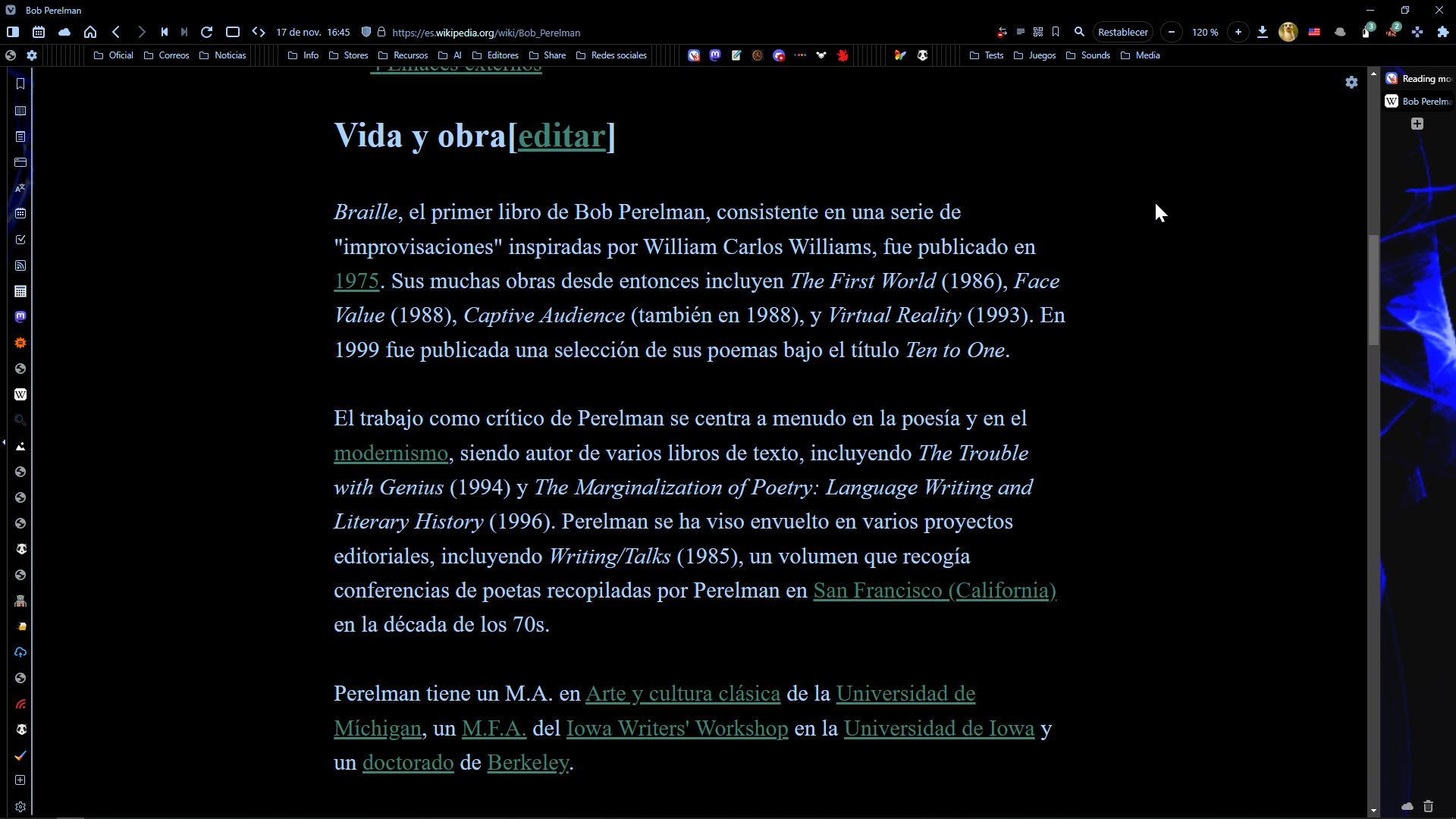
You ask what the problem is, here I send you a picture, where I show you what the problem is, I have more pictures, but I don't want to saturate you, in front of the clear problem that the browser has.
Since you were challenging, I challenge you to enter the following page, in incognito mode, and activate the reading mode.
www.bbc.com/mundo.
And you yourself can see what I'm talking about, not only on that page, on any page that you enter with Vivaldi, will show the same problem, use Vivaldi against Edge or Opera and you will see what I'm talking about, I challenge you to do it and answer me. -
The reader mode from the Andisearch engine doesn't work on all pages either. This always depends on the page format, if it works or not.
Big companies like MS or Google have much more resources to alleviate this problem. -
Use the extension Reader View:
https://chrome.google.com/webstore/detail/reader-view/ecabifbgmdmgdllomnfinbmaellmclnh
It has the advantage that you can define URLs that automatically open the mode Reader view.
-
@barbudo2005 thanks for your recommendation, I installed it and I'm testing it, and if it works well, better than the reading mode of the Vivaldi browser, however, it is still much better reading mode in Edge and Opera.
-
What is your motivation for using Reader mode?
1.- Bigger size of font
2.- No images
3. Theme
4.- etc. -
@barbudo2005 The reading mode allows me to concentrate much better.
-
@barbudo2005 thank you very much for answering and informing me about the extension, I find it very useful, and I would really like the vivaldi reading mode to work like this, I thank you again for taking the time to answer my question.
-
Said:
The reading mode allows me to concentrate much better.
In addition, reading should be easy and rest your eyes.
1.- THEME
In Edge the white on black theme has too much contrast and is tiring to the eye. As much as black on white.

Compare to this:

Almost black almost white.
The extension has a Custom styling:

So paste this code in that section:
/* THEME */

html, body, #body, main

{background-color: #171b1d !important;
color: #d8d8d8 !important;}
2.- PARAGRAPH
Sans-serif fonts are easier to read because they are simpler.
I use the font "Lato" that is very good for readability.
https://fonts.google.com/specimen/Lato
Line spacing and justified paragraph are very important for easy reading.
So paste this code:
* p *,
.post-body *,
.article-content,
.page

{font-size: 34px !important;
font-family:Lato !important;
font-style: normal !important;
font-weight: 400 !important;
text-align: justify !important;
line-height: 1.6667 !important;
min-width: 1060px !important;
max-width: 1060px !important;
margin-right: auto !important;
margin-left: auto !important;
float: none !important;
text-rendering: geometricPrecision !important;
-webkit-font-smoothing: subpixel-antialiased !important;}
You can play with the width 1060px to suit your taste
3.- COLORS FOR VISITED WEBS
Paste this code:
/* L I N K S */

/*NOT VISITED NEW*/

a:link, a *:link h1:link, h2:link, h3:link

{color: #3f81ea  !important;
text-decoration: none !important;}


/*VISITED*/

a:visited, .fl:visited, *:visited


{color: #00663e !important;
text-decoration-line: none !important;}
4.- TITLES
Paste this code:
/* TITLES */

[class *= "h1"], [class *= "h2"], [class *= "h3"], #reader-title

{font-size: 44px !important;
line-height: 1.6 !important;
font-family: Times New Roman ! important;
color: #3365c7 !important;
font-style: normal !important;
font-weight: 800 !important;
text-decoration: none !important;
text-align: justify !important;}
Don't forget to apply the save button:

So, the reader view is:

-
@zyteker Hi - your issue with the Reader Mode not triggering correctly on the BBC Mundo site appears to be a bug specific to Private Windows.
It also seems to be fixed in the latest 5.6 Snapshot.
For now, a workaround is simply to click once inside the web page to have Reader mode trigger.
Video: https://ttm.sh/0GP.mp4
Remember to set your Reader Mode user preferences in a regular window first, as the settings button is not available in a Private window (most likely another bug...)
-
@Pathduck Thank you very much, first for taking your time and answering my question, and second for the valuable information you gave me, I did not know the trick you gave me to make it work with a click.
Hopefully version 5.6 will correct the inconvenience, as you mentioned.
Thank you again, I really appreciate your help. -
@barbudo2005 Hello, thank you very much for taking your time and answering my question, I will follow the recommendations you gave me.
There is an aspect that you mention in your answer, which seems very important to me, regarding visual fatigue, and I was very struck by the image, where you see the black background, with blue font, I would like to know if you recommend this style, to reduce this fatigue?
I am sorry if maybe I did not understand well what you wanted to tell me, but keep in mind that we both speak different languages, and it is possible that, when translating, I interpret a little different to what you want to explain to me. -
You might find this information helpful.
Most studies have shown that reading text written with black characters on white (light) background is better for the eyes than reading the same in white text with black (dark) background. In the experiments, the subjects read with 26% greater accuracy when they read with dark characters on a light/white background. The science (physics) behind this phenomenon is the following:
-
When the background is white, display is bright and the iris closes a bit more than normal and this decreases the effect of the "deformed" lens. With a black background the iris opens a bit more to receive more light and the deformation of the lens creates a much fuzzier focus at the eye. This is known as "fuzzing effect" or "Halation".
-
While reading text, white stimulates, in nearly equal amount, all the 3 colour receptors in our eyes . This makes reading white text on dark background stressful on the eyes.
-
It is easy to read a digital text written in black text on white background because the light that makes us read each word and letter is not reflected but absorbed. This causes much less strain on our eyes. In the case of black background with white text, the effect is opposite because the reflected light from text scatter into each other. Addition of grey tint to the background improves the situation because it means less light reflects behind the words, making it easier on the eyes.
-
Black text works better because black is a colour that does not reflect light in any part of the visible spectrum.
-
White reflects all wavelengths of light. The characters in the book being compact and close, when white reading material reflects light, the reflected light scatters and runs into neighbouring words and letters. This makes the shape of the text material harder to perceive and this strains the eyes. In comparison, when the text is black, the black colour absorbs the light around each word and letter making them easy to distinguish from one another. This causes less strains on the eyes.
-
With a tint of grey in the background, less light reflects behind the words, making it easier on the eyes. Since black colour does not reflect light in any part of the visible spectrum, the black text works better. Therefore, fixating on black text while reading will not put as much stress on the readers' eyes because it absorbs the light that strikes each word.
-
If you use a dark background, the text should be displayed in grey tint. This will not put as much stress on our eyes because grey text is not as bright as white text. It reflects less light making it easier to read. In a dark room, white text on a black ground is not much stressful on the eyes. This is because no light is reflecting off it in a dark room.
-
Black text on a light-grey background is easier to read than in a white background because less light is reflected behind the text. Grey text on dark background is easier to read than white text on dark background because less light is reflected on words.
-
-
@pelaird , it may be true on paper, but i'm an old person and a white background with black letters dazzles me and gives me a headache.
In a book the thing is different, since the white background of the paper does not emit light, as in a screen.
A white screen is for me the equivalent of looking directly into a lamp. -
-
@barbudo2005 , I use Dark mode in flags, with this I've dark mode everywhere, even in the panel, menu and in Chrome Store.
For the very few sites where it don't work so well (same in Dark Reader), I use the invert, sepia or BW filter in Page actions.>Laptop Lenovo V145 15AST, AMD A9- 9425 Radeon R5 - 5 cores 3,1 GHz RAM 8GB, GPU 2+1 GB SSD 256GB -Win10 64 v22H2| Vivaldi last stable|
-
Use this code because it does not break icons and buttons:
*:not([class*="ico"]):not([class*="icon"]):not([class*="icons"]):not([class*="fa"]):not([class*="control"]):not([class*="button"]):not([role*="button"]):not([id*="button"]):not([class*="btn"]):not(button):not(i):not(span):not(a) {font-family: Lato !important;} -
I also switched to the Reader View extension recently, though I can't recall the exact reason why. It's very good.
But if you want to fine tune just about anything in Vivaldi's built in Reader view, you can do it via user style sheet in the Stylus extension.