Vivaldi Design
-
I hope they can use real right angle on that square icon, that may fit the metro style tiles well!
-
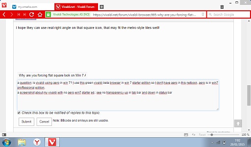
a question: is vivaldi using aero in win 7? I use this green vivaldi beta browser in win 7 starter edition so I don't have aero in this netbook. aero is in win7 proffessional edition.
a screenshot about my vivaldi with no aero win7 starter ed.: see no transparency up in tab bar and down in status bar
-
@jazei: No, it looks like this on all Windows systems.
-
It's an integrated GUI library it seems, and it won't respect your operating systems (or Window Managers) decorations. I tried it on XP x64 (which btw. is alive until mid-2015 thanks to Server 2003 updates) and XP 32-Bit (which is alive until 2019 thanks to the PosReady2009 hack).
Also, I tried on Windows 7 (EOL is 2020) and CentOS 6.6 Linux.
It's the same everywhere. I'd use it like this, but I hope there will be skinning support and an option to respect the window decorations of the system / window manager in the future.
btw., EOL systems aren't dead just because Microsoft tends to scare you into thinking so. You can even use Windows 2000 or - for christs sake even 98SE - online if you take proper precautions and are careful when using and hardening the system…
-
-1
I know that this is a matter of taste, but there is a reason why not only Microsoft w ith Modern, but also Google with Material and Apple with their designs are going into flat. If 3 biggest ecosystems are going onto it, it's not the matter of seasonal trend, believe me.
I personally love it, cause it looks not only simplier but also more modern or even futuristic.
-
Yes, there is reason why push the flat design. Money, nothing more. Its much easier and cheaper to invent one color windows backgrounds than something like Aero. That the people doesn't like it, they don't care.
I can't get
 nicer than
-
Yes, there is reason why push the flat design. Money, nothing more. Its much easier and cheaper to invent one color windows backgrounds than something like Aero. That the people doesn't like it, they don't care.
No, it's because it's less resource intensive. Curves, shadows and gradients take longer to draw than a giant monocolour square.
Nowadays the majority of the users are on mobile platforms - laptops, phones, tablets - every little saving in processing needs save battery life.
If it was just for money they would just toss billions of vector graphics all around the computer. But instead they create 20+ raster images per image for compatibility with every DPI setting and icon zoom setting. And that's because vectors are mathematical functions which takes a lot of processing power while raster images are simple read and show functions.
Edit:
And by the way, never say it's easier to design flat design. A designer will want to kick you your guts and burn them. -
it's not the matter of seasonal trend, believe me.
Why would we believe you? You're some high-end UI engineer by any chance? :whistle: :lol:
-
A primary reason in most cases is to make 'one software design to rule them all', especially mobile. In a handheld device, power drain is king… so expending any of it on cosmetic support is frowned upon. Likewise, screen real estate and resolution are extremely limited on a small display. Consequently, mobile apps run toward flat and simplistic designs. With so much user movement to mobile forms of computers (and yes, even a smart phone is a computer with phone capability), the software design objective is usually to make a given piece of software look and function similarly on all forms of computers - at least, as much as possible. Since you can't make a phone or tablet look a lot like a desktop screen without sucking the battery dry and over-loading the display, the trend has been to instead make the desktop look simpler, like the mobile universe. After a time, the style even becomes accepted by the masses and constitutes a "trend" - which exerts its own kind of peer-pressure thereafter.
-
Please tell me that you will have an option later for us that don't dig this "me to flat modern white space metro" look.
It looks terrible even on Windows 8…
Any software should always respect the operating system GUI, because going with custom GUI is disruptive for the workflow and it's never a good thing.
Inside your viewspace you could do anything*, but the common UI elements must not be changed.
It's one of the basis in user interface.Vivaldi failed on this, flat interface is ok, but the colored address bar and white "title" bar are distracting.
Thinking about it, the colored address bar could just be less saturated. The color could remain, but the change should be lighter.
*anything which is not stupid, obviously
-
- 1
Please Vivaldi respect each OS GUI, Windows 8/10 flat gui (menu/title bar) doesn't belong to Windows 7… looks so out of place.
-
I also use Win7 but what are you going to do eventually?
Win7 is not developed anymore since a couple of weeks. It will only receive some critical patches and then its over. Not even security patches, just like XP it will be EOL (End of Life) and you will have to make a choice. That means upgrading or let your computer be hacked from left to right if you decide to run insecure software. Linux and Mac is also going with a flat design so its not like you really have much choice.
I installed the Windows 10 preview and I can tell you as someone that hates Win8 that I like Windows 10 a lot. I will upgrade when its out even when Windows 7 works for me right now, I don't want to stay in the past. Windows 7 is already 6 years old.
Its not 100% confirmed that Aero will die either. If enough people vote in the Microsoft website, they will ship Windows 10 with Aero again.
Windows 7 still has 5 years to go before it's out of extended support (just like that XP recently ran out of extended support).
Extended support means no new features, UI redesigns and bug splatting, but there will still be patches for security issues.I do agree that W10 looks very good so far and promising.
But when it comes to W7 which still has till 2020, Vivaldi should respect the OS GUI since currently it really looks out of place.
-
It's not only on Windows 7, it's out of place on Windows 8 too…
-
It will only receive some critical patches and then its over. Not even security patches, just like XP it will be EOL (End of Life) and you will have to make a choice.
It will get no more new features, but patch support for normal bugs and for security will go until 2020 (and beyond for (expensive) paid support, like with XP now, so there are still 5 years left until you have to make the decision.
-
If it helps, setting the tabs to either the sides or the bottom creates a title bar that is the website's color.
-
Loving the design too, hopefully we just get option make the buttons smaller like in Opera 12, though not a priority but would be nice.
-
I also like the design, very professional and stylish.
Perfect for daily use.
-
Well … for someone like me who makes ALL his Windows versions look like classic Win 95 (simplest is best) Vivaldi's look and feel is PERFECT!!!
If only I can change icons to text ... looking ... looking ... looking ... it must be in a menu somewhere. Hehehe! -
I'm happy with the design, too. For what it's worth, it feels not complicated.
-
I have always been the person who loves the simple designs. This design is just great!