Overlay panels
-
@kallon You can already do it with the code previously posted
@Morg42 I saw it, but I'm as precise as an elephant in a glassware XD
I think it's not the best solution for me but I don't pretend anyone to spend hir time to write lines of code. It's just a suggestion, maybe someone gets here and finds out ze need this feature like it's oxygen
I think I didn't write in English, sorry :c -
@holotaco precise... you're talking about "hitting" the border? I have enabled the small "panel switcher". If the window is not at the border of the screen, I also have to aim precisely; mostly the window does end at the screen border, so I just drive the mouse pointer into the left barrier. It can recuperate while I'm using the panel
")
Otherwise, it is possible to (re-)change the code so the panel container (with the icons) stays open all the time and only the panels fly out. Not as neat, but easier to hit...
-
I'm also interested in closing the overlay as soon as a click outside the panel happens.
It's the natural behaviour of overlays, like seen in Windows start menu or window menus (File, Edit, View, ...)An extra button for that behaviour would be nice, although I think keeping the panel open as an overlay doesn't make too much sense as it partially hides web content and for me it never happens that I navigate a site with left clicks (unlike scrolling) while leaving my Bookmarks or Downloads panel open.
So for me it could also make sense to merge functionalities in the exisiting Toggle button:
Untoggled: Panel resizes webpage and stays open until pressing the current panel button (->classic sidebar)
Toggled: Panel as overlay which closes if mouse is pressed on webpage (->classic overlay)The hover feature is also nice, but not so much in windowed mode/on tablets and for me the less natural one.
I hope that a vivaldi employee could pick up some of the proposals posted here and deliver it as a nice finished product with in-browser settings (ღ˘⌣˘ღ) -
@g3nbas I agree concerning tablets - but then the concept of "hovering" need mouse pointers to act on in the first place...
Windowed mode might be an annoyance, as you have to "target" the slim line exactly. Possibly you can keep the panel selector (with the icons) open, so you have a wider margin of error (or target).
As you don't want to click outside the panel while it's open, it seems even more naturally for me to close it if the mouse pointer leaves the area (and as it opens again without any page interaction, so you can open and close it even with actions outside Vivaldi in between. (Internally, the panel is open all the time, just hidden).
The code can be modified to open/close the panel in an overlay way (instead of pushing the page aside), which is also describe in a topic which I don't have handy right now. I tried it and it was much more counterintuitive to have an overlay/flyout which I needed to close manually. So I went with the hover/flyout variant.
-
@morg42 The variant pop-out only panel; show panel-container permanently makes the panel-container cover a portion of the page instead of showing next to the page. I think for this to work ok the code should include a resizing of the page in order that full content can be displayed.
Overlay should only be once I hover the mouse on the panel. Right? -
@kallon Yeah, that's right.
For the mentioned functionality you need to change the js code. The needed code is already there, only commented out.
Change
// pop-out both panel-container and panel
		var csso_tmpl = '#main .inner { position: relative; } #panels-container { position: absolute; z-index: 25; top: 0;  bottom: 0; width: 6px !important; background-color: var(--colorBg); transition: width 0.2s linear 0.2s; } #panels-container:hover { width: ###px !important; }';

// pop-out only panel; show panel-container permanently
//		var csso_tmpl = '#main .inner { position: relative; } #panels-container { position: absolute; z-index: 25; top: 0;  bottom: 0; width: 34px !important; background-color: var(--colorBg); transition: width 0.2s linear 0.2s; } #panels-container:hover { width: ###px !important; }';
to
// pop-out both panel-container and panel
//		var csso_tmpl = '#main .inner { position: relative; } #panels-container { position: absolute; z-index: 25; top: 0;  bottom: 0; width: 6px !important; background-color: var(--colorBg); transition: width 0.2s linear 0.2s; } #panels-container:hover { width: ###px !important; }';

// pop-out only panel; show panel-container permanently
		var csso_tmpl = '#main .inner { position: relative; } #panels-container { position: absolute; z-index: 25; top: 0;  bottom: 0; width: 34px !important; background-color: var(--colorBg); transition: width 0.2s linear 0.2s; } #panels-container:hover { width: ###px !important; }';
in the js file and try again. It should work...
")
-
@morg42 Hey that was a quick reply!
I didn't make myself clear. I already knew how to change between options.However, the issue I am exposing is that the always visible piece of panel does cover the page instead of sticking next to it. It is more noticeable when you choose pop-out only panel; show panel-container permanently
-
@kallon Yeah, I know what you mean and I was sorely convinced that the code does exactly that.
However, on reading the code again, I found the two code snippets are identical, so uncommenting one instead of the other achieves a great and glorious ... nothing.
I'll just dive into it and hope to come out head first
//edit...
Okay, so this didn't get me further. It seems that for the "complete" hover solution, there is a container #panels-container which includes all the switcher and container items. As it includes shown and hidden elements, it can be used for the :hover argument.
If I want to only show ("pop-out") the panel itself, I'm at a loss how to change one element's CSS by hovering over another. I'm not even sure this is possible, but certainly not by me, sorry.
Maybe some of the other CSS gurus here are able to help you on this; without some guidance, I can't.
-
@morg42 It's pretty straightforward, if you want to use css only, you can only change a child element when you hover the parent, but not vice versa. It's called cascading style sheet for a reason. But I have no idea what you guys are talking about ^^
-
Ok I see I am not being able to tell what's happening (not English native speaker).
I took a screenshot of Vivaldi home page and this it what it looks like: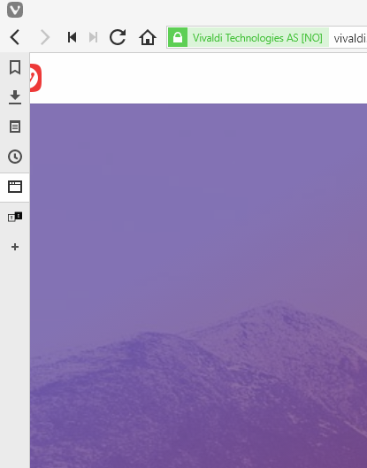
See that the panel container covers a portion of the page? Look at the Vivaldi logo.
Does this happen to you as well?
-
-
-
@kallon Shifting the webpage on hover to make room for the panel container looks clumsy and I don't even know if that's easily possible. But by all means, try to make it happen. Good luck.
-
@luetage I think we are back at my earlier ... wall.
The shown panel container should not hover and not overlay, but be visible permanently. On hover the panel should pop out as an overlay.
I tried it, but I didn't get it to work...
-
Not sure if this helps anyone but here's the code I'm using and it seems to do what you want.
I suppose it's worth noting that I'm only using pure css since I don't care about the toggle functionality.
#main .inner {
    position: relative;
}
#panels-container {
    position: absolute;
    z-index: 1;
    top: 0;
    bottom: 0;
	background-color: var(--colorBg);
	opacity: 0.9;
}
.address-top.bookmark-bar-bottom #panels-container,
.address-top.bookmark-bar-off #panels-container {
    top: 1px;
}
#panels-container.right {
    right: 0;
}
#panels-container.left + #webview-container, #panels-container.left ~ #tabs-container.left {
    margin-left: 34px;
}
#panels-container.right ~ #webview-container, #panels-container.right ~ #tabs-container.right {
    margin-right: 34px;
}
#browser.tabs-right #webview-container {
    margin-right: 0;
}
#panels-container.left.switcher + #webview-container, #panels-container.left.switcher ~ #tabs-container.left {
    margin-left: 0;
}
#panels-container.right.switcher ~ #webview-container, #panels-container.right.switcher ~ #tabs-container.right {
    margin-right: 0;
}
#browser.tabs-right #webview-container {
    margin-right: 0;
}
#browser.fullscreen #webview-container, #browser.fullscreen #tabs-container {
    margin-left: 0 !important;
    margin-right: 0 !important;
}
#browser.fullscreen #panels-container {
    position: relative;
}

@keyframes show-panel {
	0% {
		max-width: 34px;
	}
	100% {
		max-width: 500px;
	}
}
@keyframes hide-panel {
	0% {
		max-width: 500px;
	}
	100% {
		max-width: 34px;

	}
}
#panels-container /*.panels .panel-group*/ {
	animation: hide-panel 2s ease forwards !important;
	animation-delay: 1s !important;
}
#panels-container:hover /*.panels .panel-group*/, #panels-container:focus-within /*.panels .panel-group*/ {
	animation: show-panel 0s ease forwards !important;
}
#panels-container:after {
	background-color: transparent !important;
}
Oh and also this is for panel on the right not the left. You can use it as is on the left but the animations don't look as nice.
-
@narsis Thanks for your cooperation. Does this support mouse hover opening panel function?
-
@kallon As far as I know yes.
-
I've tested a few ideias out here, but none worked (for me) that well, so i sorta put together my alternative for this mod. It allows to toggle between normal mode (default), overlay mode (on click) and overlay mode with on hover trigger (open panels by hover. closed when no longer 'in the area')
Feedback would be appreciated ^^/** * Author: Leonardo Domingues * * #Web panel display enhancer * Toggle between * - Resize (Original) * - Overlay -> Click * - Overlay -> Hover */ setTimeout(function wait() { var adr = document.querySelector(".toolbar-addressbar.toolbar"); if (adr != null) { // Panel Overlay Toggle var switchS = document.getElementById('switch'); var btnS = document.createElement('button'); var svgS = document.createElementNS("http://www.w3.org/2000/svg", "svg"); var pathS = document.createElementNS("http://www.w3.org/2000/svg", "path"); var circTarget = "d: path('M 13 13m -6, 0a 6,6 0 1,0 12,0a 6,6 0 1,0 -12,0 M 13 13m -4, 0a 4,4 0 1,0 8,0a 4,4 0 1,0 -8,0 M 13 13m -2, 0a 2,2 0 1,0 4,0a 2,2 0 1,0 -4,0'); fill-rule: evenodd"; var circEye = "d: path('M 13 13m -5.5, 0a 5.5,5.5 0 1,0 11,0a 5.5,5.5 0 1,0 -11,0 M 13 13m -2, 0a 2,2 0 1,0 4,0a 2,2 0 1,0 -4,0'); fill-rule: evenodd"; var cirdRing = "d: path('M 13 13m -4, 0a 4,4 0 1,0 8,0a 4,4 0 1,0 -8,0 M 13 13m -2, 0a 2,2 0 1,0 4,0a 2,2 0 1,0 -4,0'); fill-rule: evenodd"; //on click var csso_overlay = '#main .inner { position: relative; }/* Overlay */ #panels-container { position: absolute; z-index: 1; top: 0px; bottom: 0; }#panels-container.right {right: 0; }/* Overlay - Sides */ #main.left #webview-container { margin-left: 0px;} #main.right #webview-container { margin-right: 0px;} /* Fullscreen */ #browser.fullscreen #webview-container { margin-left: 0; margin-right: 0; } #browser.fullscreen #panels-container { position: relative; }'; btnS.classList.add('preferences'); btnS.id = 'overlay'; btnS.setAttribute("tabindex", "-1"); svgS.setAttributeNS(null, "width", "26"); svgS.setAttributeNS(null, "height", "26"); svgS.setAttributeNS(null, "viewBox", "0 0 26 26"); switchS.lastChild.style = "margin-top: 0px"; switchS.insertBefore(btnS,switchS.lastChild); btnS.appendChild(svgS); svgS.appendChild(pathS); // startup in normal mode var styleS = document.createElement('style'); styleS.type = 'text/css'; styleS.innerHTML = ''; document.getElementsByTagName('head')[0].appendChild(styleS); btnS.setAttribute("title", "Sobreposição"); pathS.style = cirdRing; var mode = 0; var panel = 0; // toggle logic document.getElementById('overlay').addEventListener('click', function() { if (mode == 0) { styleS.innerHTML = csso_overlay; btnS.setAttribute("title", "Sobreposição 2"); pathS.style = circEye; mode = 1; }else if (mode == 1) { styleS.innerHTML = csso_overlay; btnS.setAttribute("title", "Encaixe"); pathS.style = circTarget; mode = 2 for (let index = 0; index < switchS.getElementsByTagName('button').length - 3; index++) { switchS.getElementsByTagName('button')[index].onmouseover = function(){ if (!switchS.getElementsByTagName('button')[index].getAttribute('class').includes("active")) { switchS.getElementsByTagName('button')[index].click(); panel = index; } }; } document.getElementById('panels-container').onmouseleave = function(){ if (switchS.getElementsByTagName('button')[panel].getAttribute('class').includes("active")) { switchS.getElementsByTagName('button')[panel].click() } }; }else { for (let index = 0; index < switchS.getElementsByTagName('button').length - 3; index++) { switchS.getElementsByTagName('button')[index].onmouseover = ''; } document.getElementById('panels-container').onmouseleave = ''; styleS.innerHTML = ''; btnS.setAttribute("title", "Sobreposição"); pathS.style = cirdRing; mode = 0; } }); } else { setTimeout(wait, 300); } }, 300); -
Works as expected, good job.
The only thing I would add (and this is just personal preference) would be a transition. It can reduce accidental triggers with a delay and look nicer too. And even if it does get unwittingly triggered, the transition will bring a portion of the panel into view instead and then retract rather than having the whole thing popping out over the page.
hmm, upon further testing, for me the hover effect makes the panels themselves too sensitive, it's too easy to unintentionally switch from notes to bookmarks, etc.
-
@sjudenim First of all, thanks for the compliment.
I think I can give a try and work on the transition effect (and perhaps adjust the hover effect to trigger after a few ms, to smooth it a bit) on my spare time, will update you if I'm successful.
