Vivaldi 1.11 – Focus on accessibility
-
@pesala: Nice catch, thanks! Updated now.
-
V is for Vivaldi!
-
@ToKrCZ Thanks. Ok, so the icon in the UI is correct (the menu icon is slightly different due to scaling), but not in your task bar. Cached graphics perhaps – try a reboot? As for the font's being smaller, I'll need to investigate a bit further.
-
Ah, superb
-
@apocalypse: Top of the hit list at the moment are Sync, Mobile and Mail, all of which are in progress now.
")
-
Thanks for this fantastic new version.
-
Congratulations on this new release!
-
@jonmc: Thanx for reply. This is why i love your project. U always hear the Community :-). Greets.
-
Congratulations...
Waiting for the implementation of even more requests : https://forum.vivaldi.net/topic/17488/feature-requests-for-1-11/930
-
@jonmc: oh yeah ! ^_^ maybe sync for 1.12 ?
 and goodbye Google chrome
-
Honestly I do like the old icon more than the new one...
-
Do you realize there is no consistency with the icon that shows in the menu and the one that shows in the taskbar right? One is completely red, the other one has white with red borders.
I would have tried to keep the square form and just make the edges a bit round. While I don't mind rounded borders on the icon, personally I think it's overdone. You rounded it so much that the square looks deformed and it is not a circle either. So now it looks like a TV icon, more like Youtube.
The V was already a bit rounded, so there was no need either to go that hard on the square box. It makes it look cheap, not elegant or professional. Of course when it comes to taste everything is a personal opinion
-
@karst124: I like the older one better as well.
They should have rounded it like this icon:
https://www.schoettler-software.com/images/CalcTape-138.pngBut they have overdone the curves.
-
I've given it a few weeks, but I have to say I still don't like the squircle...
Fan of everything else though!

-
@terere said in Vivaldi 1.11 – Focus on accessibility:
Do you realize there is no consistency with the icon that shows in the menu and the one that shows in the taskbar right? One is completely red, the other one has white with red borders.
I would have tried to keep the square form and just make the edges a bit round. While I don't mind rounded borders on the icon, personally I think it's overdone. You rounded it so much that the square looks deformed and it is not a circle either. So now it looks like a TV icon, more like Youtube.
To be honest, I really like a new icon. Definitely more than the old one
 At the same time this is true that this little UI inconsistency is annoying.
 -
@zandathrax: Time will tell, but it's definitely getting closer
-
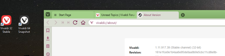
I have just updated to 1.11 Stable 32 bit (on Windows 10 64 bit).
However, the "menu squircle" is Black (as in snapshot version) and not Red (although both desktop and Taskbar squircles are red).
Note: I do have Snapshot (64 bit) installed as well. Could there be a bleeding of the "menu squircle" from Snapshot to Stable?
Edit to add image
-
@tbgbe: Themes using
Apply Accent Color to Windowwill get a monochrome version of the icon, in this case black (changes to white depending on luminecense). This is to make sure it's legible for all the possible background colors.Designer @ Vivaldi
-
@jonmc: I have to seek confirmation every time when this is mentioned. Does Mail still include RSS Reader or it's gone for good? Thanks!
-
Great ^^